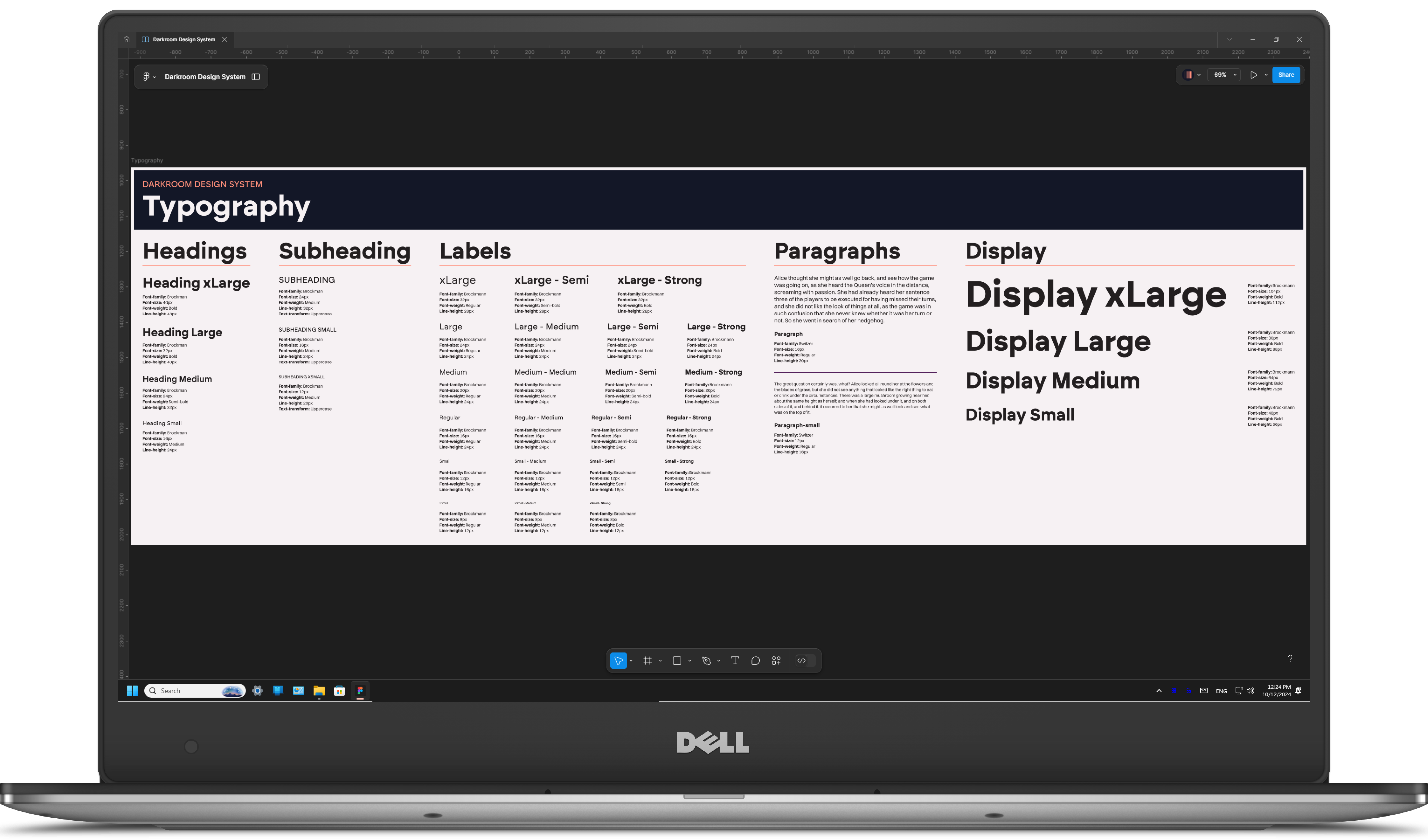
Darkroom Design System
OVERVIEW
A design system is crucial for UX, ensuring consistency, speeding up design and development with reusable components, and simplifying collaboration. Ensuring AAA WCAG compliance guarantees accessibility and smooth onboarding for new team members.
In this case study, I'll discuss some components I developed for Flashbook's Darkroom Design System as well as some of the overarching design decisions made for Flashbook's styling.
PROJECT GOALS

Create a AAA compliant UI kit of components in Figma to create rapid prototypes, clean and beautiful visual designs, and delightful and intuitive UX interactions

Build a scalable system, with consistency in mind for future growth and new features

Make practical, easy-to-use components to empower others to join in my design efforts as the business expands
LESSONS & OUTCOMES

I have become a Figma guru and I don't say that lightly. There is now no component I lack the confidence to build.

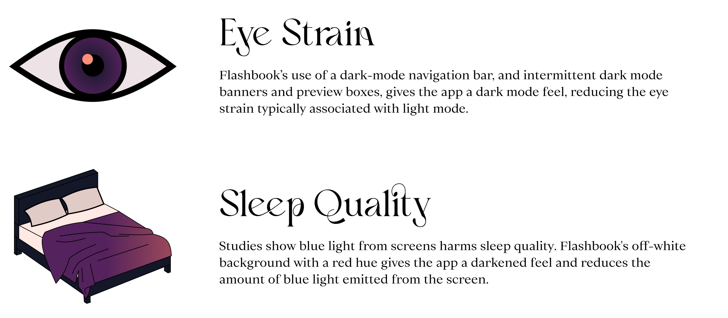
Intentional design system choices can combine the benefits of dark mode and light mode. We kept all the ease of light mode while gaining the dark mode benefits of reduced eye strain and lower blue light emission.

Building Flashbook's design system deepened my understanding of WCAG guidelines, enabling us to achieve AAA compliance from the start. This proactive approach prevented accessibility debt, ensuring an inclusive experience without costly retrofits.
ROLE
Lead Product Designer
Figma, WCAG Guidelines, Color Theory, Auto-Layout, Branding, Design Systems
MY INPUT
- Establish product branding direction (colors, styles, typography, etc)
- Build robust, adaptable, and accessibly components in Figma and in code
- Establish rules and guidelines for all content, color, and component usage
- Design for scalability and speed - Though the design system took time, it ultimately made designing the app quicker and easier allowing us to move faster and farther.

Choosing a Navigation
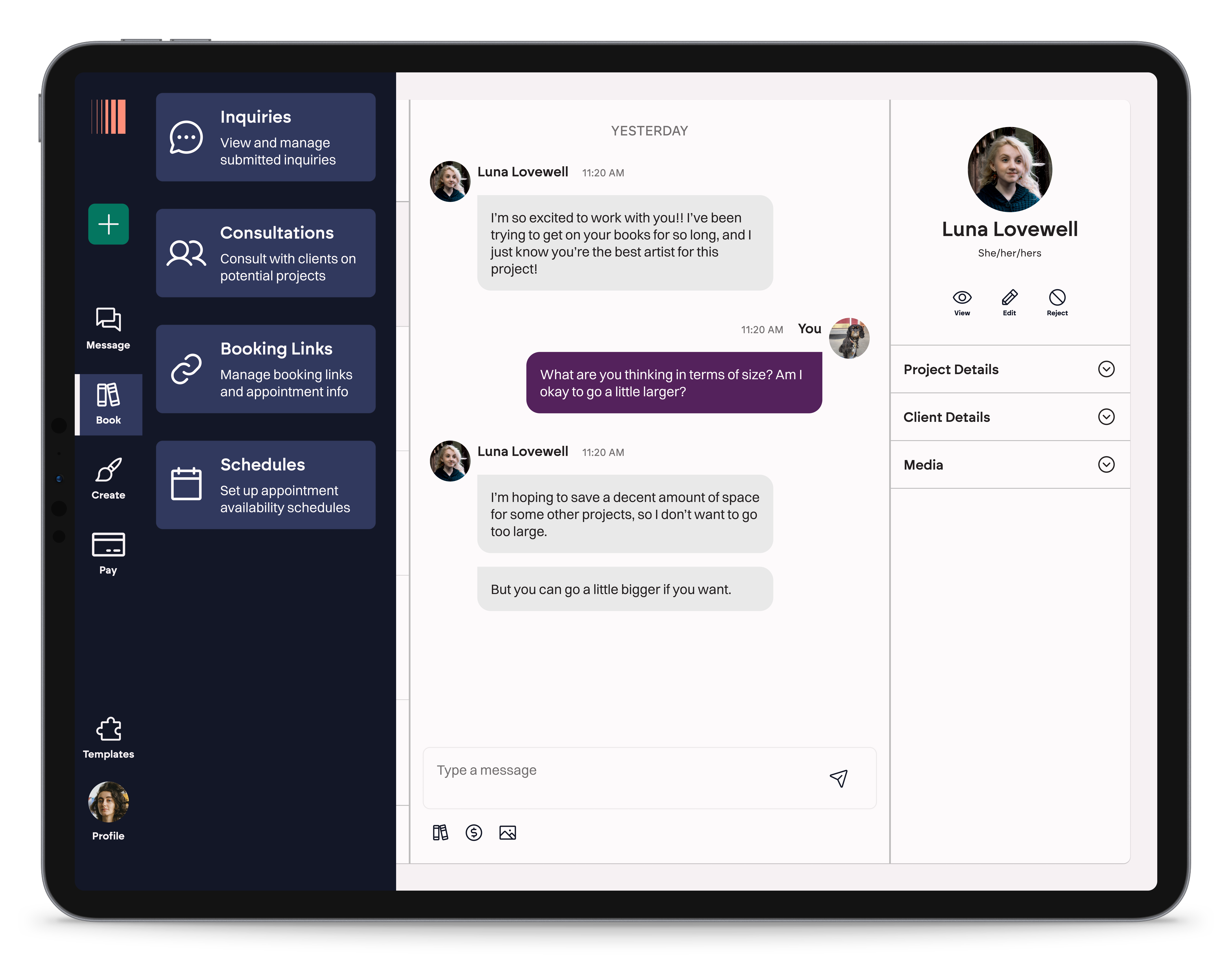
Flashbook was designed with the understanding that the overwhelming majority of our initial target audience would be using Flashbook with their iPads. They'd be jumping back and forth from their art to their Flashbook. They'd collect payment at the end of a tattoo session straight from their iPads that were already there for their reference images. Although Flashbook is built as a progressive web app, everything needed to scale well for artists to be able to use Flashbook on their iPads.
The left-hand nav accomplishes a few things specifically for our iPad users

The navigation takes up less screen real-estate and is optimized for landscape iPad usage (the orientation artists almost always use their iPads in)

Navigation links are large and tappable. Especially secondary navigation links.

Primary navigation links are reachable using the thumb while holding the iPad. IOW, it's more accessible.
Dark Dampens Light
I'm a dark mode purist.
If I could dark mode all the things, I would. Dark mode drains less battery, it reduces eye strain, it's shown to increase focus, reduce screen flickering, and can even improve sleep quality. But there are some (wrong) people out there who insist on using light mode. And light mode is frankly a little easier to build. One thing we weren't going to do was sink development time into building a switchable experience. There's a time and a place for that, and V1s and startups are neither the time, nor the place.
But what if there's an alternative, middle ground?
The Darkroom Design System's buttons are designed to be accessible in both dark mode and light mode, meaning the only development change needed to include these dark mode elements was a class for dark text. Easy peasy.
Mixing dark mode elements into the light mode app brought many of the dark mode benefits to Flashbook, while also creating a modern looking platform that won't alienate users who prefer one mode over the other.
Library Constraints
In order to speed up development time, we used a handful of free javascript libraries to build our components. This meant that some designs had to comply with the libraries we were using, with minimal CSS changes.
THE DATE PICKER
We searched high and low for a simple date picker. Users won't need to select date ranges until way down the road. It needed to be simple, and we frankly really liked the design of the MUI date picker. We found a simpler version of that to build ours with.

THE RICH TEXT EDITOR
The rich text editor was similarly difficult to choose. So many of the industry favorites are akin to Notion's in-line editor, and we didn't want that. We also wanted it to allow our users to customize their text pretty extensively.
In the end, we found a library called Lexical to integrate with. We customized the editor slightly by adding a button to "Insert Template" where users could import templated text into the text box. Lexical looks clean, modern, and offers greater customization opportunities to our customers than any other free alternatives.

In Summation
The Darkroom Design System significantly boosted development efficiency for our small team. By creating a library of reusable components, we saved countless hours and established a solid foundation for rapid iteration. This system allowed us to build components first and then seamlessly slot them into the app, streamlining the development process.
The design system provided a cohesive structure that simplified collaboration and ensured AAA WCAG compliance, helping us avoid accessibility debt. Overall, it laid the groundwork for scalable, efficient growth as we continue to enhance Flashbook.
