
Flashbook Consultation Workspace
OVERVIEW
After advamcing a project past the inquiry stage, artists needed a way to conduct consultations. During consultations, they needed to be able to collect additional information about a project, request images of the location/canvas or of the project's inspiration, and send out booking or payment links for their clients to schedule the project. The consultation workspace seeks to provide all necessary information in a modern, clean, and distraction free environment.
PROJECT GOALS

Provide all project information in a way that doesn't feel cluttered
Center client-interaction. The consultation is supposed to give artists and their clients a chance to get to know each other and decide if there is a mutual fit.
Allow artists to send booking and payment links to their clients to get projects scheduled
LESSONS & OUTCOMES
Giving clients the ability to resize things not only makes things feel modern, it helps eliminate distractions and create a feeling of empowerment
Users reported high satisfaction with giving consultations a dedicated spot in Flashbook. They needed a way to make consultations modern and digital, Flashbook gives them that.
Simplify, simplify, simplify. My first attempts were trying to do too much. Simplifying to one task per screen made the app far more consumable.
ROLE
Lead Product Designer
User Research, Prototyping, User Testing, Wireframing, Interaction Design
MY INPUT
- Set up and conducted user interviews with artists (current beta users, and target future users)
- Created journey maps to understand what needed to be included on the consultation page
- Iterated on designs, based on research and feedback, to progress from wireframe to full fidelity
Cramming it All Together
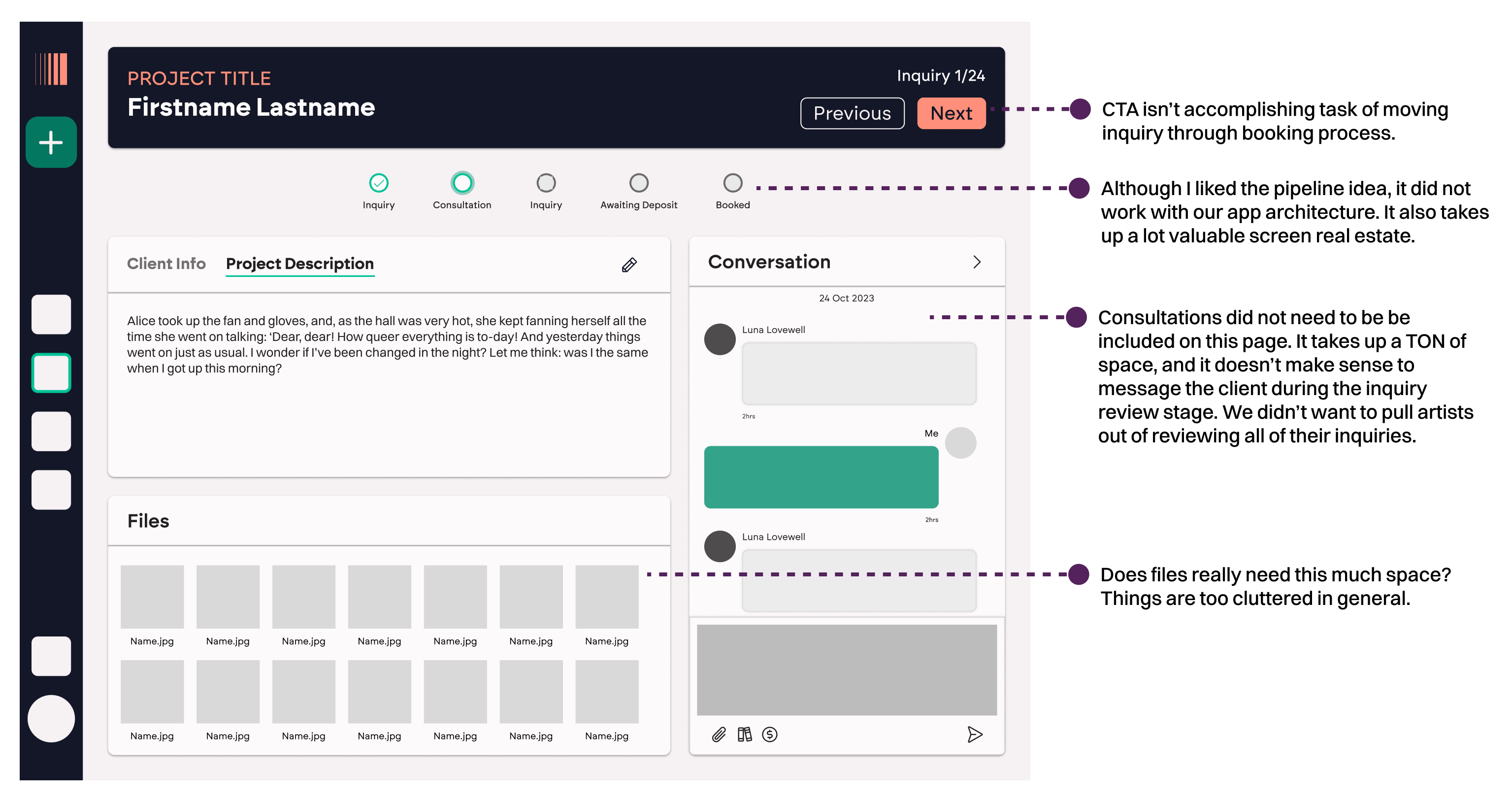
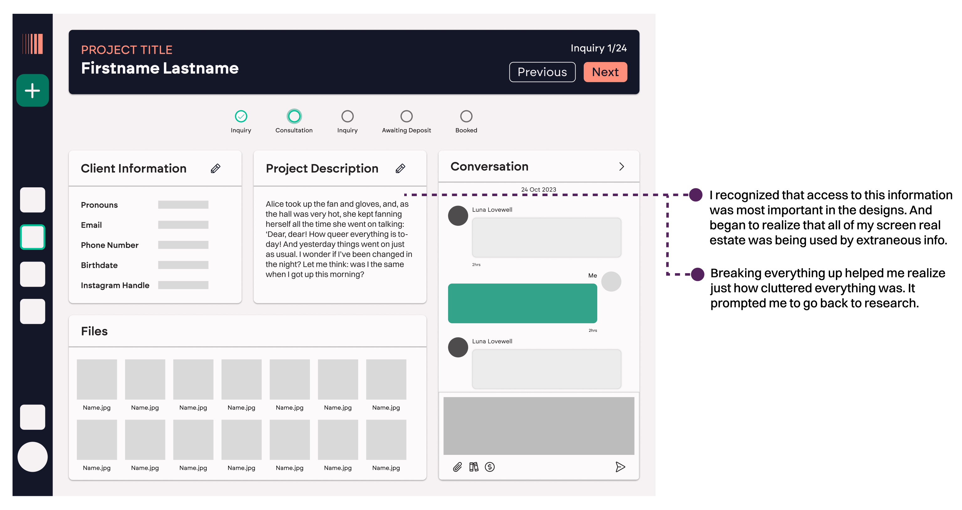
Let's get something clear. The consultation workspace did not originally exist. I didn't plan for it in my initial journey maps. I didn't see it as a separate piece of the puzzle for artists. And so, initially, I was trying to cram consultations into the inquiry review section of Flashbook.
This idea was poor. Very poor. My initial wireframes for inquiries were terrible and I struggled mightily with how cluttered the designs felt and the wealth of information presented and worked with on just one card.
So I turned to our users.
I reached out to some of friends in the tattoo industry and asked them to walk me through their process of booking an appointment again. I told them I was particularly interested in all the events that take place before the appointment is scheduled.

I knew this process. It's the same process I use when taking on commission work. But for whatever reason, I tried to cram consultations into the inquiry review process when it was clear they were separate entities.


Breaking it Out
Sometimes when we're designing, things go really smoothly. This was the case with the consultation workspace. You know, after the little mishaps at the beginning. Once I had determined the need to sever consultations from inquiries, the designs for both almost designed themselves.
When I went back to users, one of the most common problems I heard regarding their current booking process was the lack of human connection. Art is a very personal and expressive field and (especially during Covid) artists have been feeling like they are losing that human element with their current booking processes.
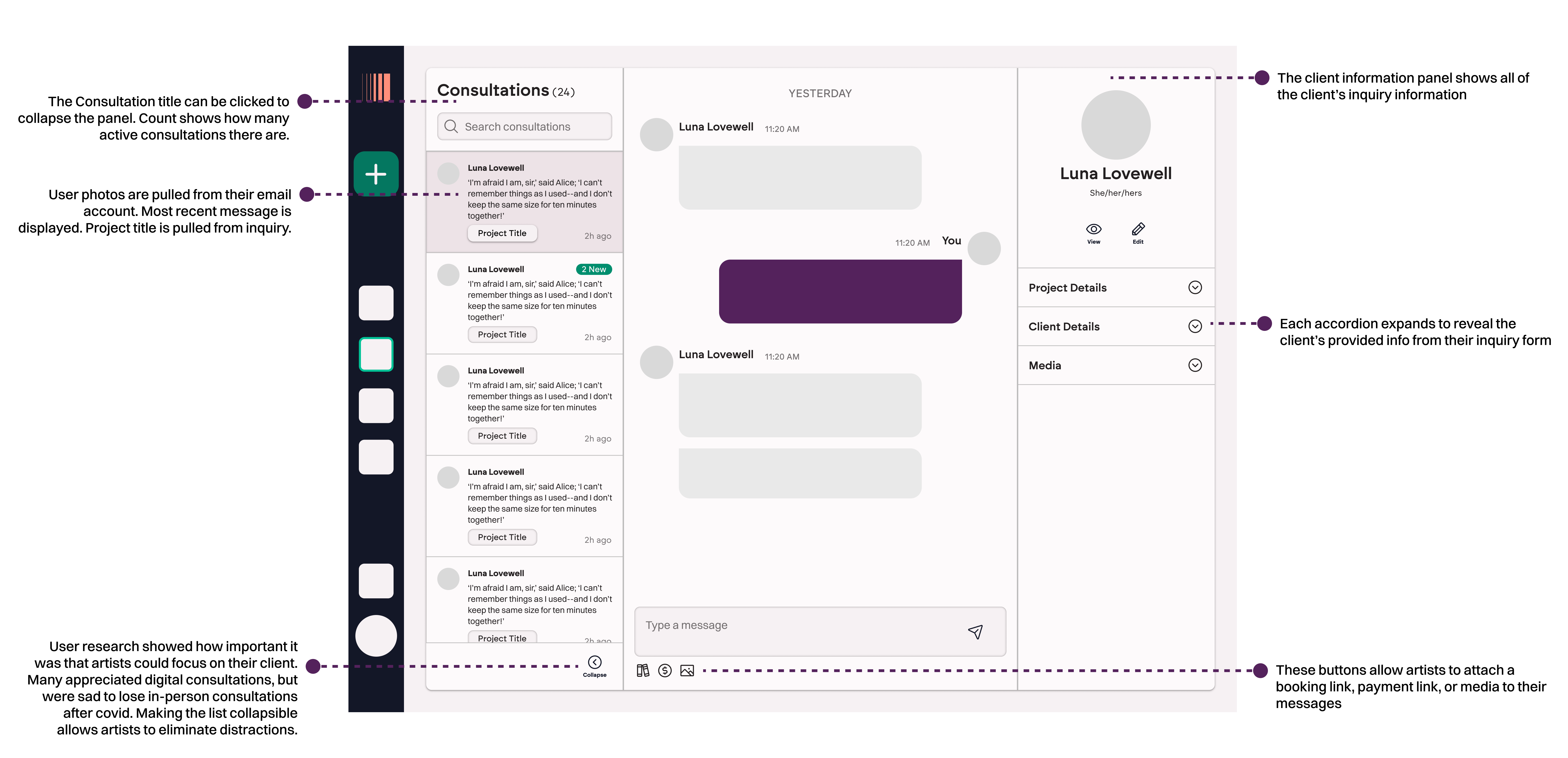
I wanted the consultation workspace to help reinstill human connection into user's art. I knew that the consultations needed to make conversations the central focus (literally and figuratively). I also knew that I needed to be able to present most of the inquiry information up front and center for the artists to quickly access during the consultation.
Enter expanding components. The consultation list can be collapsed, as desired, to eliminate distractions and really focus on the conversation. At the same time, a user's data is fully available to the artist in the right column, with relatively quiet accordions to progressively disclose the info, and to show only what is needed at that moment, at a glance.
Stewards of Our Users
Going from wireframes to full fidelity was pretty seamless with this project. Because we will likely be integrating with various Javascript libraries for the messaging and gallery portions, those designs are bound to change slightly. Throughout Flashbook, I've had to toe the line of technical feasibility for two mostly junior developers (me and my co-founder), with what my hopes and dreams are from a design aspect.That's meant designing some things that end up needing some large revisions down the road to accommodate constraints introduced by development decisions.
I always try to design by pushing the envelope first. I want to be innovative and encourage engineers and the company as a whole to challenge ourselves to put out the best possible product. I've known designers who design strictly within their constraints and I think that's a mistake. We are supposed to be the stewards of our users and although there are times we may be forced to make concessions in our designs, I think it's important that we design freely and push for the best experience. And you can always trim things up, but if auditing and addressing UX debt for 3.5 years at Canopy taught me anything, it's much harder to prioritize adding UX enhancements after the fact than it is start there in the first place.
Try it out
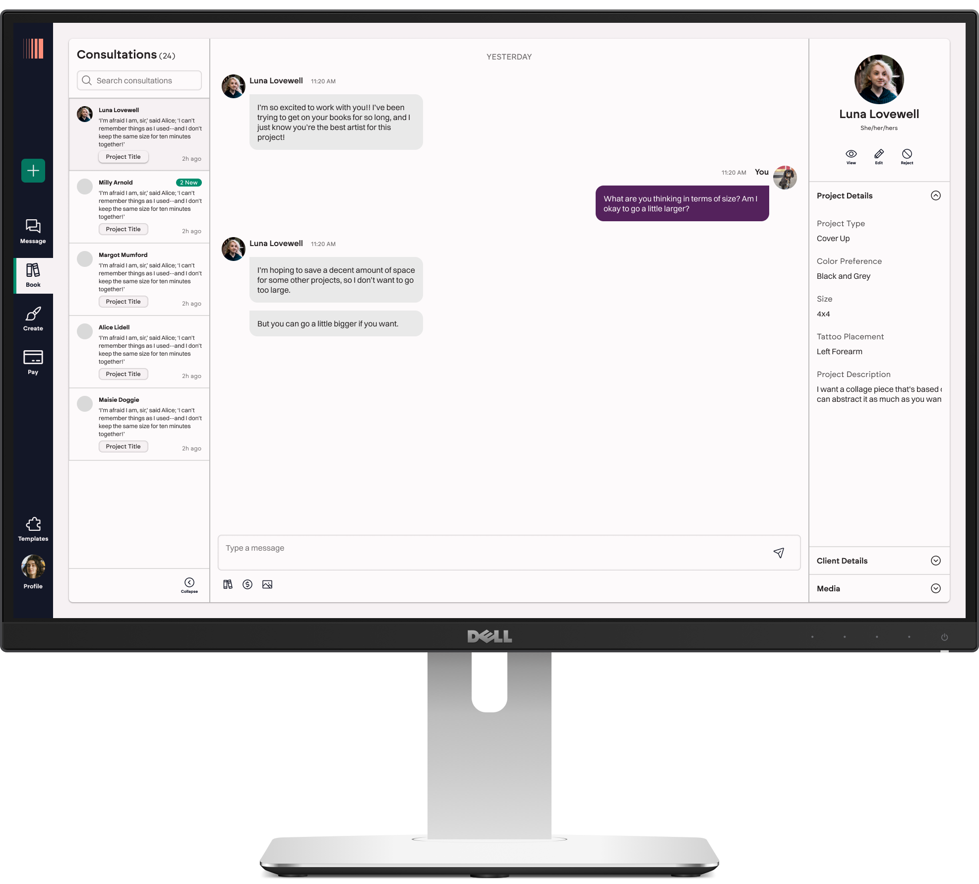
Expand the prototype below and navigate to your Consultations found in the Book section of Flashbook. From there, send a message to your client and be sure to attach an appointment link.
** Prototypes work best on a desktop or tablet