In-app Messaging and Onboarding
OVERVIEW
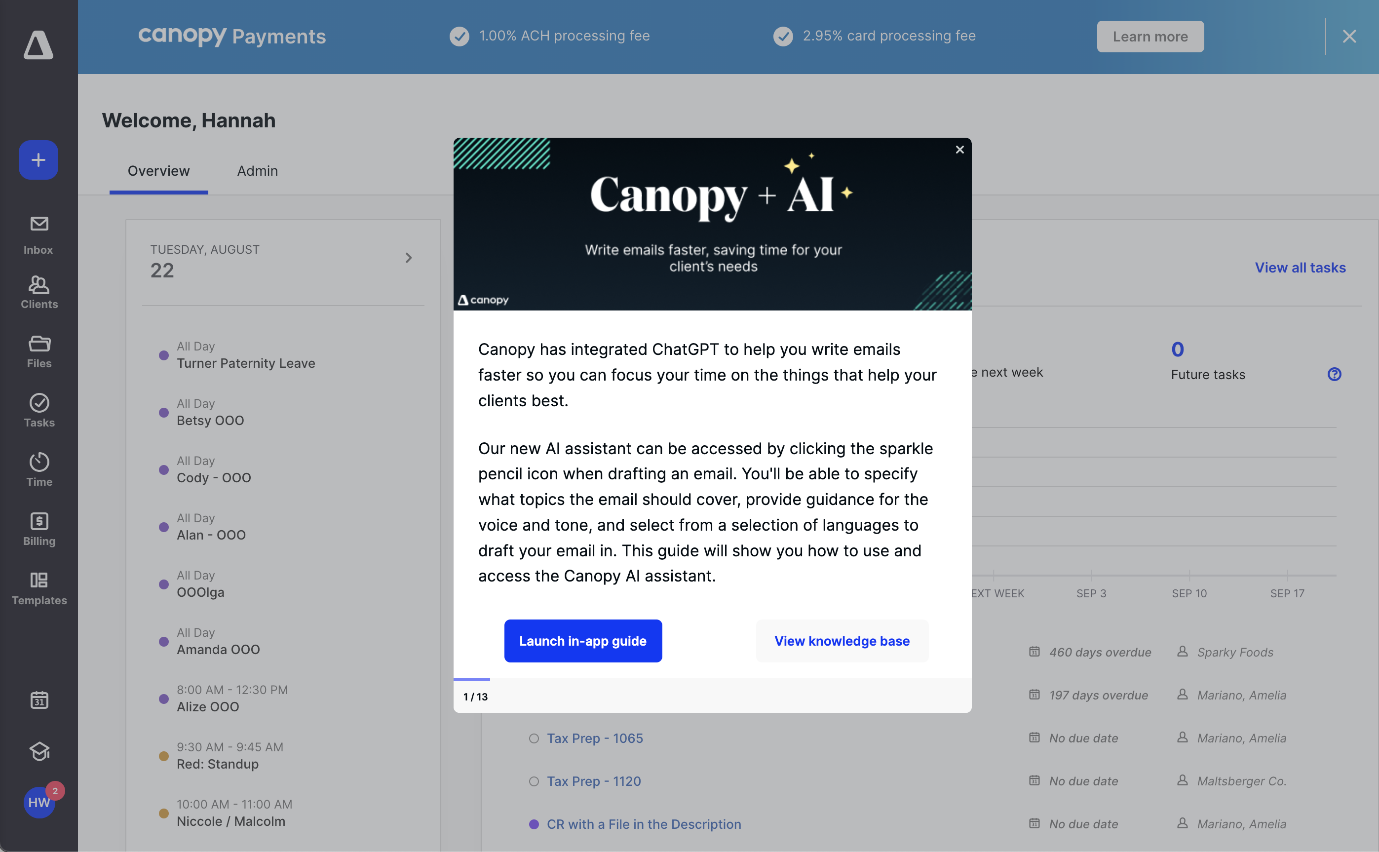
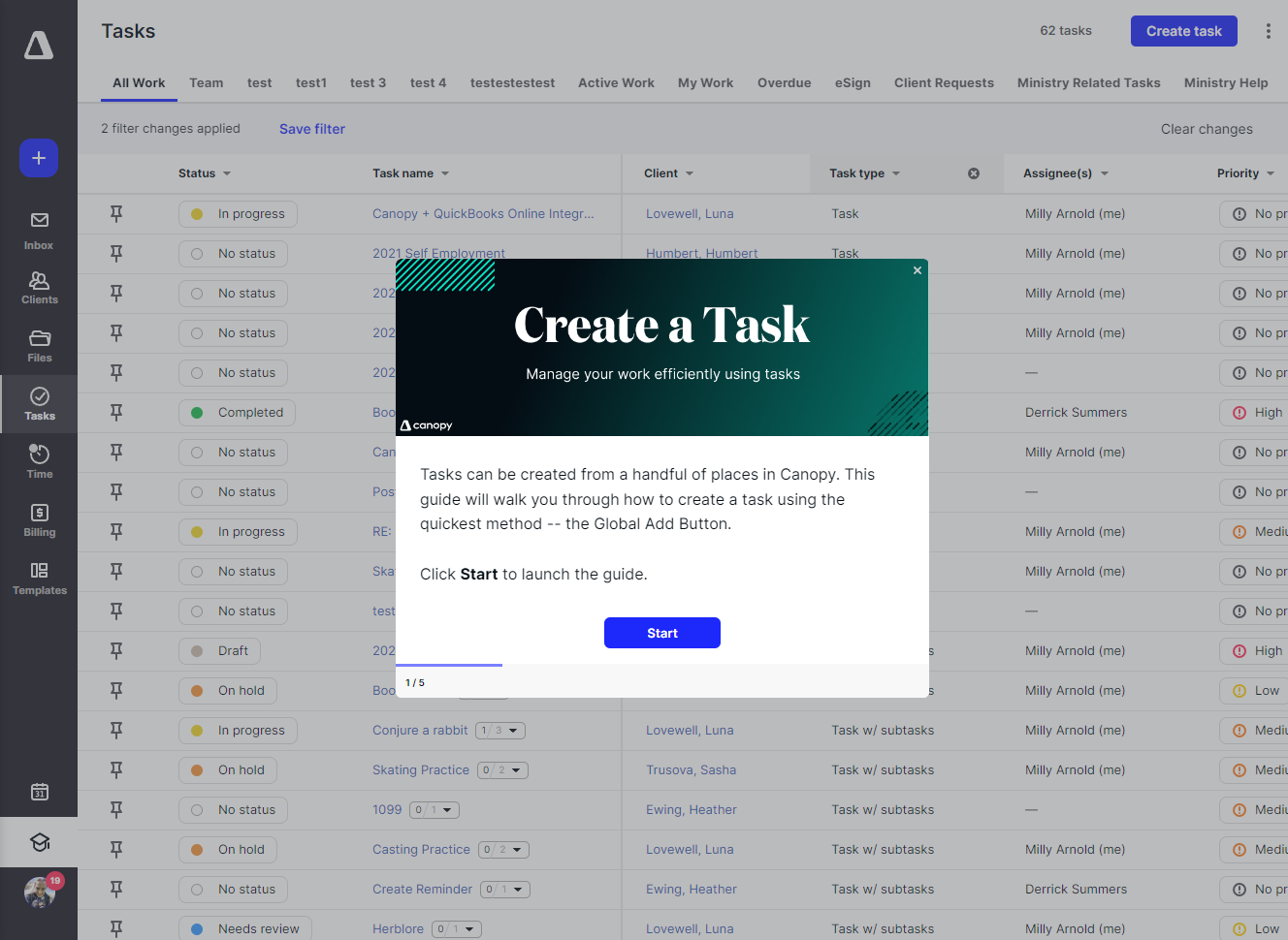
As the sole content designer and only trained writer at Canopy, I was tasked to be the gatekeeper for all content published to our product. I created a process for in-app content submission, review, and publication. I accepted cross-departmental content requests (marketing initiatives, support notices, product announcements), wrote all associated content for the request, designed any required creative materials, and coded and pushed live each announcement and request, ensuring quality and consistency.
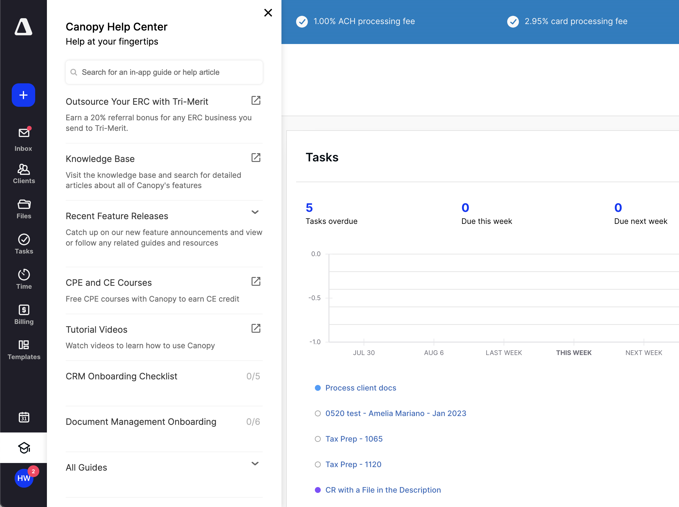
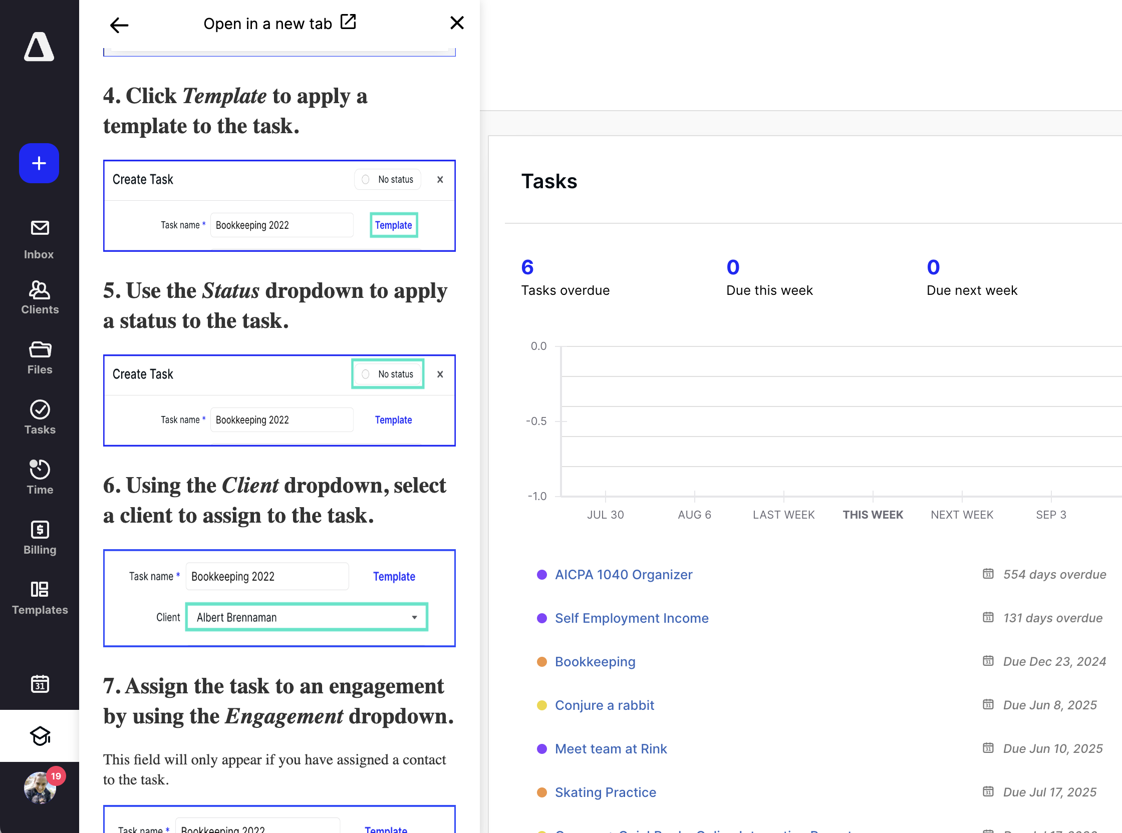
Using UserGuiding, I also pitched the implementation of a custom resource center within Canopy's app. The resource center served as a home base for all customer education initiatives in the app. Users could view help center articles in-app, follow in-app user guides, view recent feature release announcements, and so on. The resource center also served as an area to place all ongoing surveys to test designs and solicit feedback on recent releases.
GOALS
- Ensure that in-app messaging was used appropriately, always accounting for its effect on the user experience
- Provide a one-stop shop for all in-product requests
- Guarantee consistency for in-app voice, tone, graphics, illustrations, and interactions
LESSONS
- Overcommunication is key for interdepartmental projects in order to maintain alignment and eliminate frustration
- In-app messaging is a powerful tool, but overuse can have a serious and negative effect on the product's UX
- All in-product customer touch points must feel consistent and purposeful
ROLE
UX and Content Designer
Google Workspace, UserGuiding, HTML, CSS, Figma, Illustrator, UX Writing, Javascript, ClickUp/Jira/Asana, Adobe After Effects
MY INPUT
- Define a process for requesting in-app messages
- Collaborate with cross-departmental stake holders and staunchly advocate for the best user experience
- Design, illustrate, and sometimes animate all creative materials
- Write or edit all content to adhere to the Understory design system
- Design the messaging layout to follow UX best practices and maintain in-app consistency
- Code all messages, embed code into UserGuiding, and push live to customers
- Track all messaging campaigns to ensure we never overwhelm users
- Design a custom resource center implementation and create new learning paths for users
Creating a Resource Center
In order to consolidate help resources, keep users in the app (not link them to external areas), and improve Canopy's information architecture, I pushed to implement an in-app resource center. Integrating with UserGuiding, I designed a custom implementation to launch the resource center from the grad cap icon on Canopy's navigation bar.
Once the resource center was implemented, I was able to conduct research with users to determine optimal learning/onboarding paths for Canopy. I identified which processes were most important to different sized firms, and set about building in-app guides and compiling knowledge base resources for a variety of learning paths users identified as necessary.
The resource center allowed me to clean up other menus in Canopy and better focus our information architecture. It also brought all of our knowledge base articles right into Canopy, preventing users from having to click back and forth between different websites. They could search all available help articles or in-app guides in one place. I also added a list of recent feature releases, and added the ability to list various UX and product surveys to be taken directly in the app.
Communicating with Customers
Becoming a Gatekeeper - Cross-departmental Collaboration
In-app messaging is a powerful tool. It's a sure-fire way to grab a user's attention, and has a far greater conversion rate (up to 20% better) than other messaging methods. Because in-app is so successful, people from all departments want to use in-app messaging to accomplish their goals. As the keyholder for in-app messaging, it was a constant battle to advocate for the user experience and keep in-app messaging from gaining a reputation for being spam. This could sometimes lead to other departments being frustrated with UX, but I learned that as long as I overcommunicated when and what could be put in-app and explained the why, all stakeholders would come around. I created a process to track all in-app messages on a calendar, keep analytics in one place, and collect all information for in-app requests from whoever submitted the request.
Designing a Message
After receiving an in-app request, I would set about completing all the rest of the work myself so that the requester would never have to worry. I designed the flow of guides, wrote all associated content, and illustrated/designed all of the creative materials, and coded the designs into each modal. Because guides were typically made prior to the release of a new feature, I was also able to don a QA hat and work closely with each squad designer to ensure that the flow of each feature was intuitive and working correctly. One benefit of UserGuiding was the option to add my own custom HTML and CSS to any modal - This allwoed me to design each modal however I wanted it to look, maintain alignment with the style guide and design system, and create a professional, thought out end product for users. Too often, in-app integrations end up looking lazy, diverge from the app's style and branding, and ultimately reflect poorly on the product as a whole. Because I coded each modal myself, all of those frustrations could be avoided.


