Product Illustrations
OVERVIEW
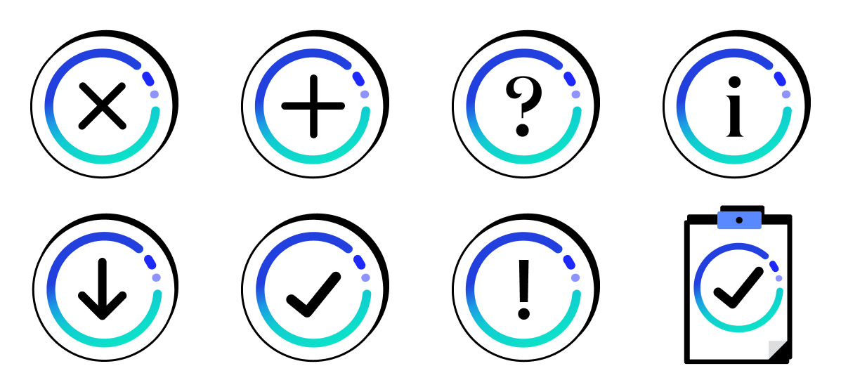
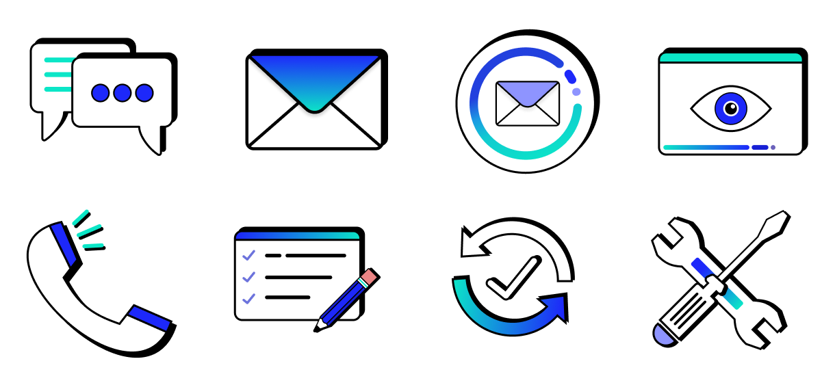
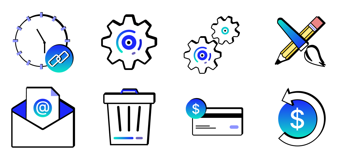
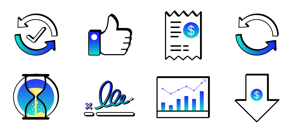
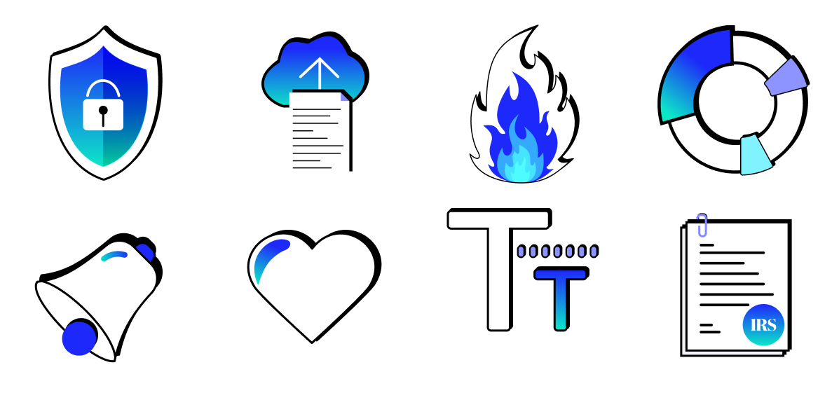
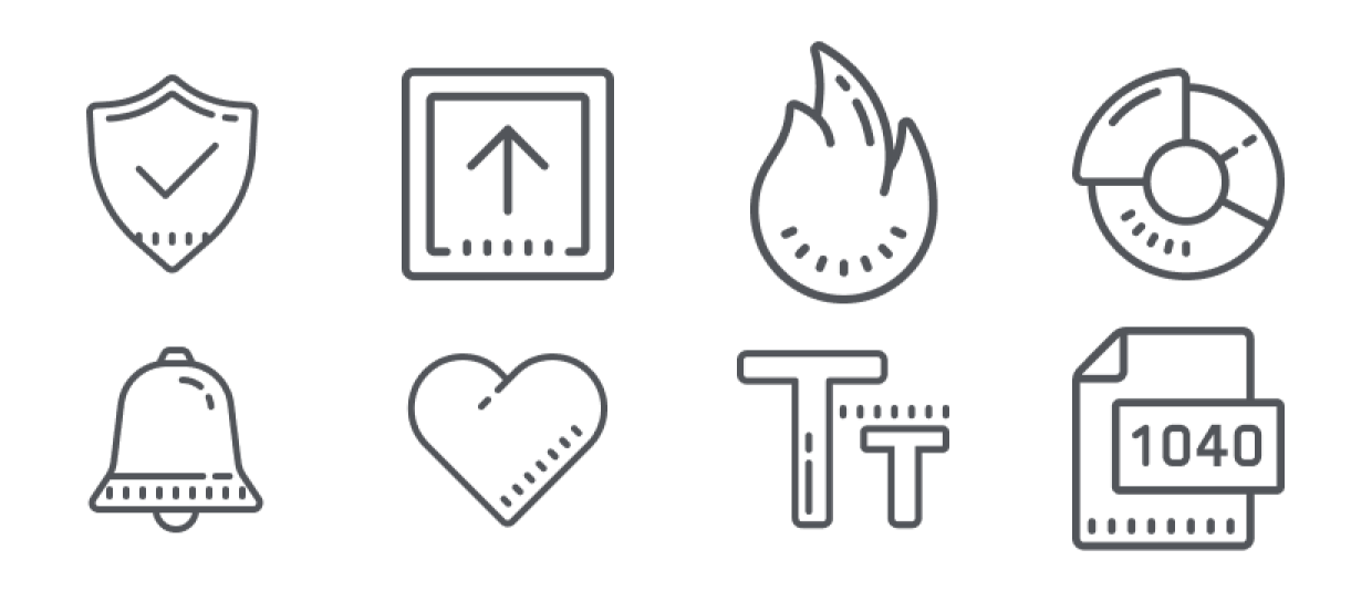
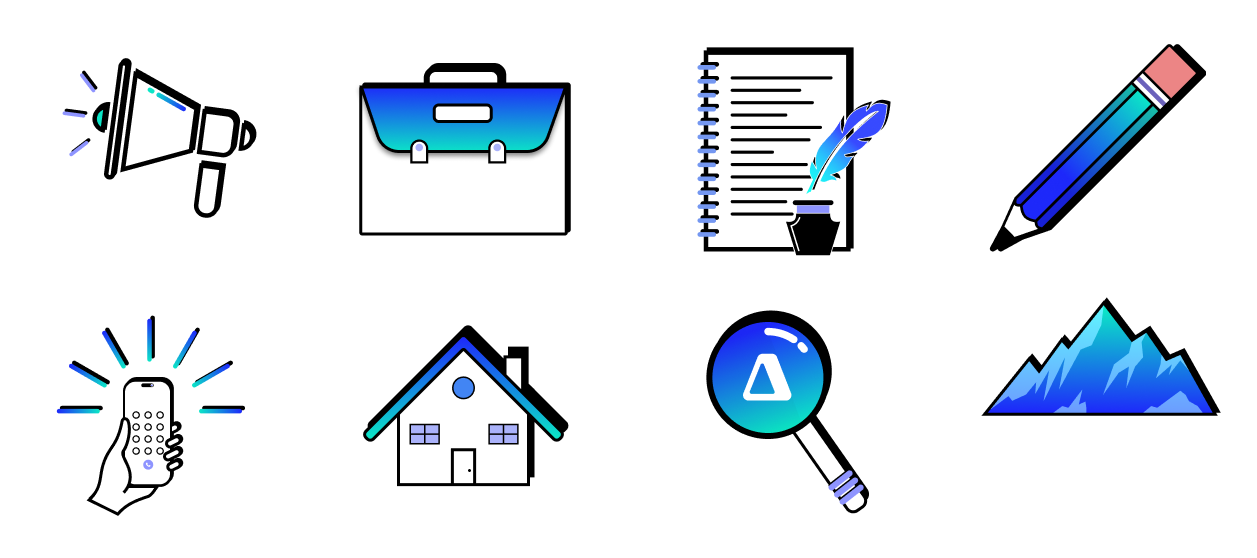
Years ago, Canopy downloaded a standard, black/grey set of illustrations to shoehorn into the app. These illustrations contained no brand identity, little personality, and generally missed on the opportunity to inject personality into the app and build brand rapport with users. In an effort to liven up the app and make it feel more like Canopy, I designed a whole new set of product illustrations for use in the app.
PROJECT GOALS

Liven up the app. Standard grey illustrations are boring and sterile
Cultivate our brand in the app and build rapport with customers by making it all feel like Canopy
Show some effort - personal branded imagery helps users feel more at home and gives the sense that we care about all parts of our app
LESSONS & OUTCOMES
The little things matter. Users don’t like staring at boring, grey imagery. It shows little effort from the team.
Figma really can serve as a total replacement for Adobe Illustrator. I learned a lot of skills in Figma for designing imagery.
Illustrations are an easy way to inject personality and branding into your product. They make everything feel more complete, welcoming, and cohesive.
ROLE
Content Designer
Figma, Graphic Design, Procreate, Art, Creativity, Brand Design
MY INPUT
- Audited and compiled all illustrations currently used in the app
- Consulted with marketing/creative to align app imagery with external imagery
- Designed multiple versions of new illustrations using Figma and Procreate
- A/B testing with different styles to decide which direction ellicited the desired feelings with customers
- Established a set of guidelines for new illustrations going forward and set up a process to get a new illustration made