Canopy Content Style Guide
OVERVIEW
Canopy’s in-app content used to have little guidance or direction. Content used to be created by a variety of different stakeholders (none of whom were trained writers) with no common guidelines for creating the content. As Canopy’s sole content designer, one of the first tasks I wanted to tackle was to audit our app’s content and use that research to create a formal product style guide.
PROJECT GOALS

Establish a consistent experience throughout the app
Empower designers to create better initial content
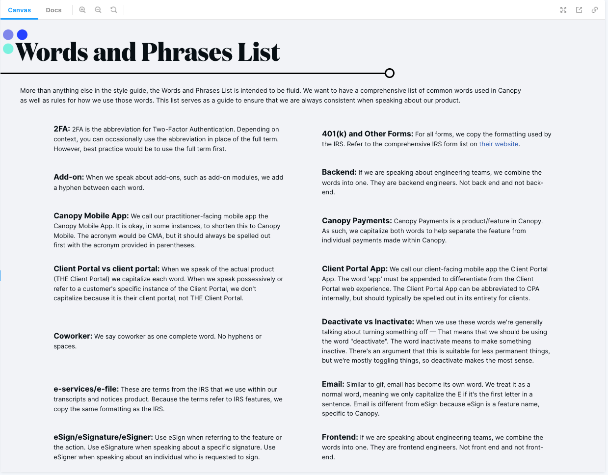
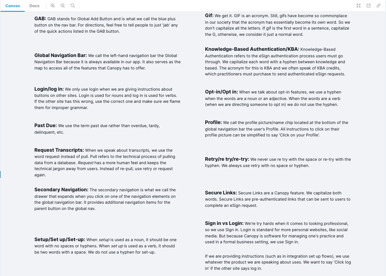
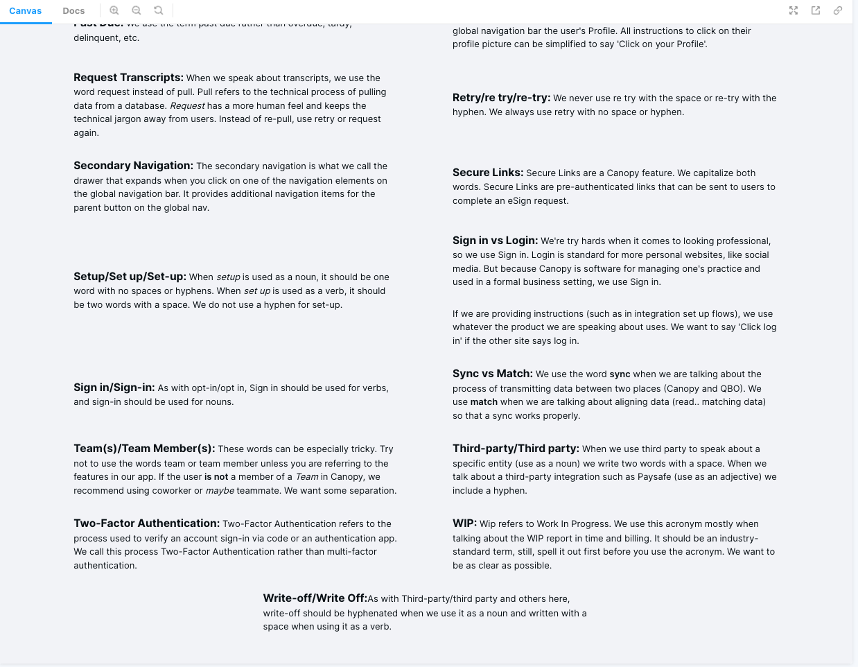
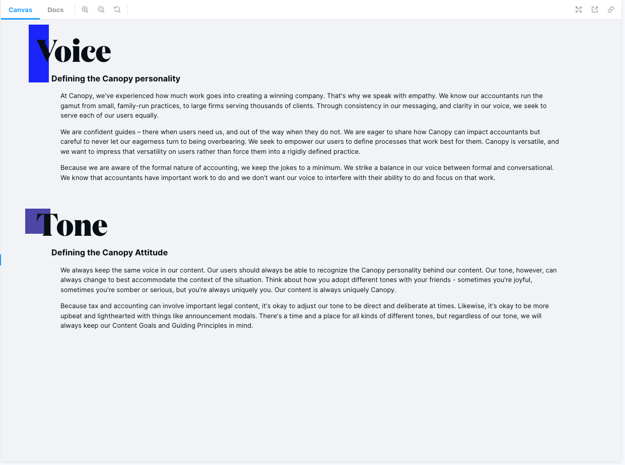
Define voice, tone, and style for in-app communications. Also create a word-bank for all departments to draw from an ensure consistent usage across the organization.
LESSONS & OUTCOMES
I learned how to code in JSX, more about how to use GIT CLI, and how to publish with Storybook
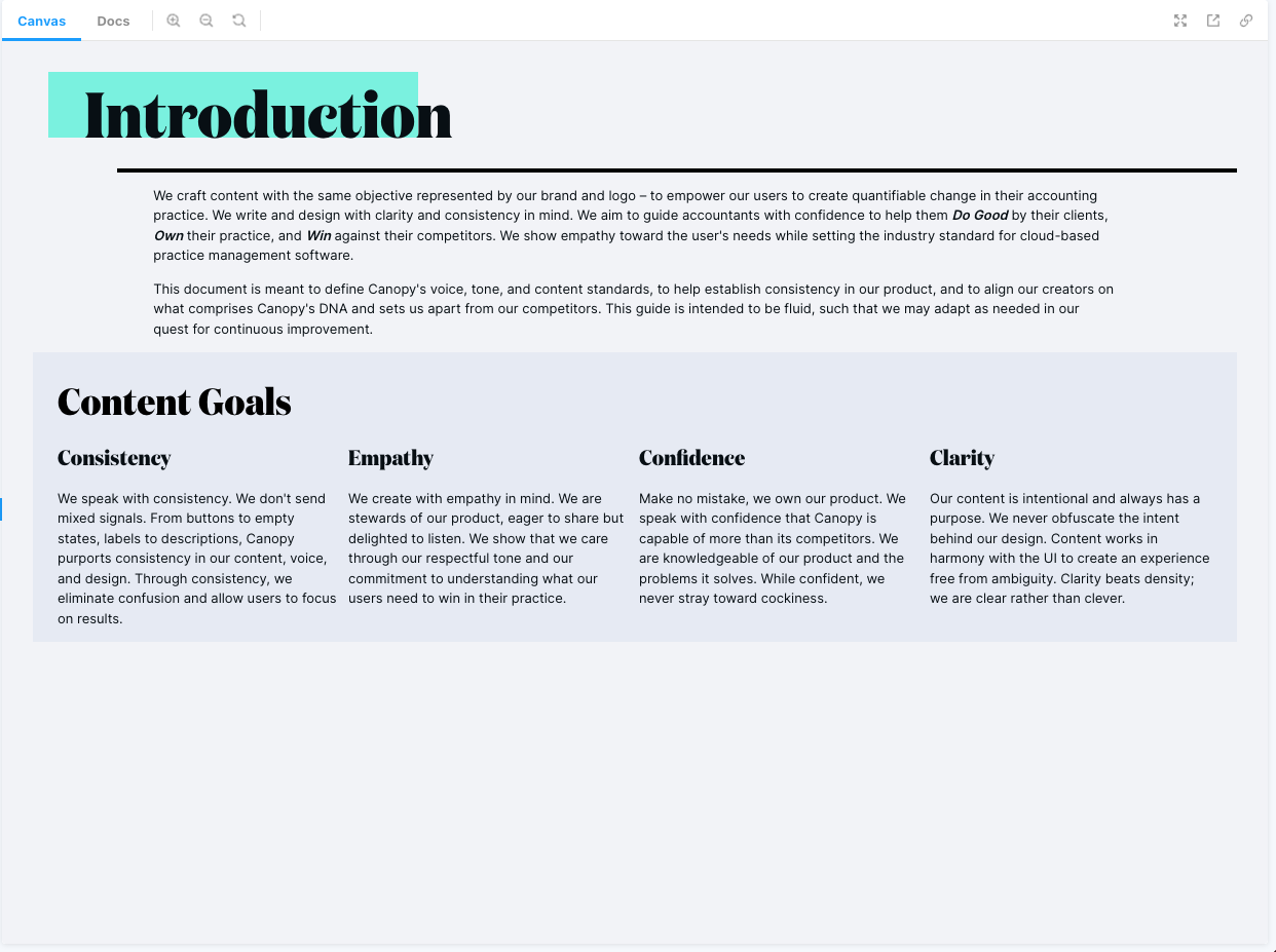
Companies develop a lot of “writing debt” when they don’t have a set style guide and dedicated writers. I ensured consistent communication standards throughout Canopy, revising content to match Canopy's brand and be clear and actionable.
Consistent content greatly improves the UX by improving user understanding and reducing time spent deciphering the voice and tone. Canopy's users knew exactly what to expect with each piece of content in Canopy.
ROLE
Content Designer
Research, UX Writing, HTML, CSS, Javascript/JSX, Storybook, GIT/GitLab
MY INPUT
- Audit all Canopy content to identify any inconsistencies
- Research competitors to compare how we speak to common customers
- Define a distinct voice and tone
- Establish rules and guidelines for all in-app content
- Design, code, and upload completed style guide to our Storybook library
- Maintain and update GIT repo for the content style guide, adding any new rules/guidelines as we define them.
Research and Audit
The first step in my research was to identify what I was working with and present it in a clear, consumable format. Once I knew what I had to work with, I wanted to compare our app to some of our most aggressive competitors. I knew that there would be significant areas for improvement, but I didn’t want to create a style guide that would entirely overhaul our app. I needed to maintain some familiarity and keep aspects that differentiated us from our competition.
Some of my competitor research was able to spill over into helping our sales and marketing teams, particularly as they dealt with price-chasing customers who were choosing a cheaper (inferior) product over ours. I presented some of my findings with the UX team to align on future research, strategy, and content initiatives. From there, we committed to running different tests alongside each designer's user tests to identify our users' preferences and make sure our content going forward met expectations.
Following my competitive analysis, I committed to auditing all of Canopy's app content to find any discrepencies, common threads, and establish a skeleton of common practices that we could build from in order to reduce engineering requirements to fix things.
Solution
Design a Content Style Guide
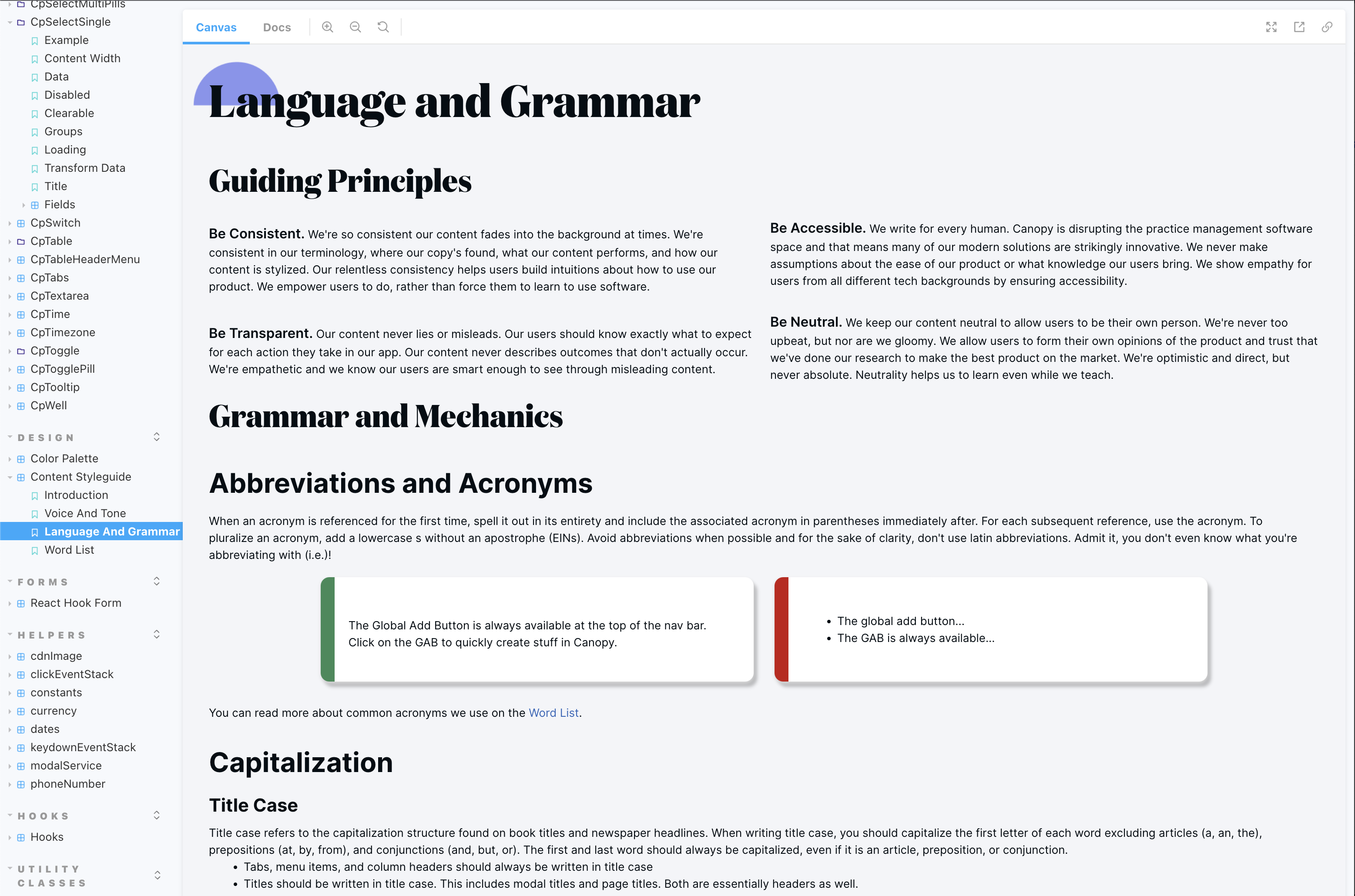
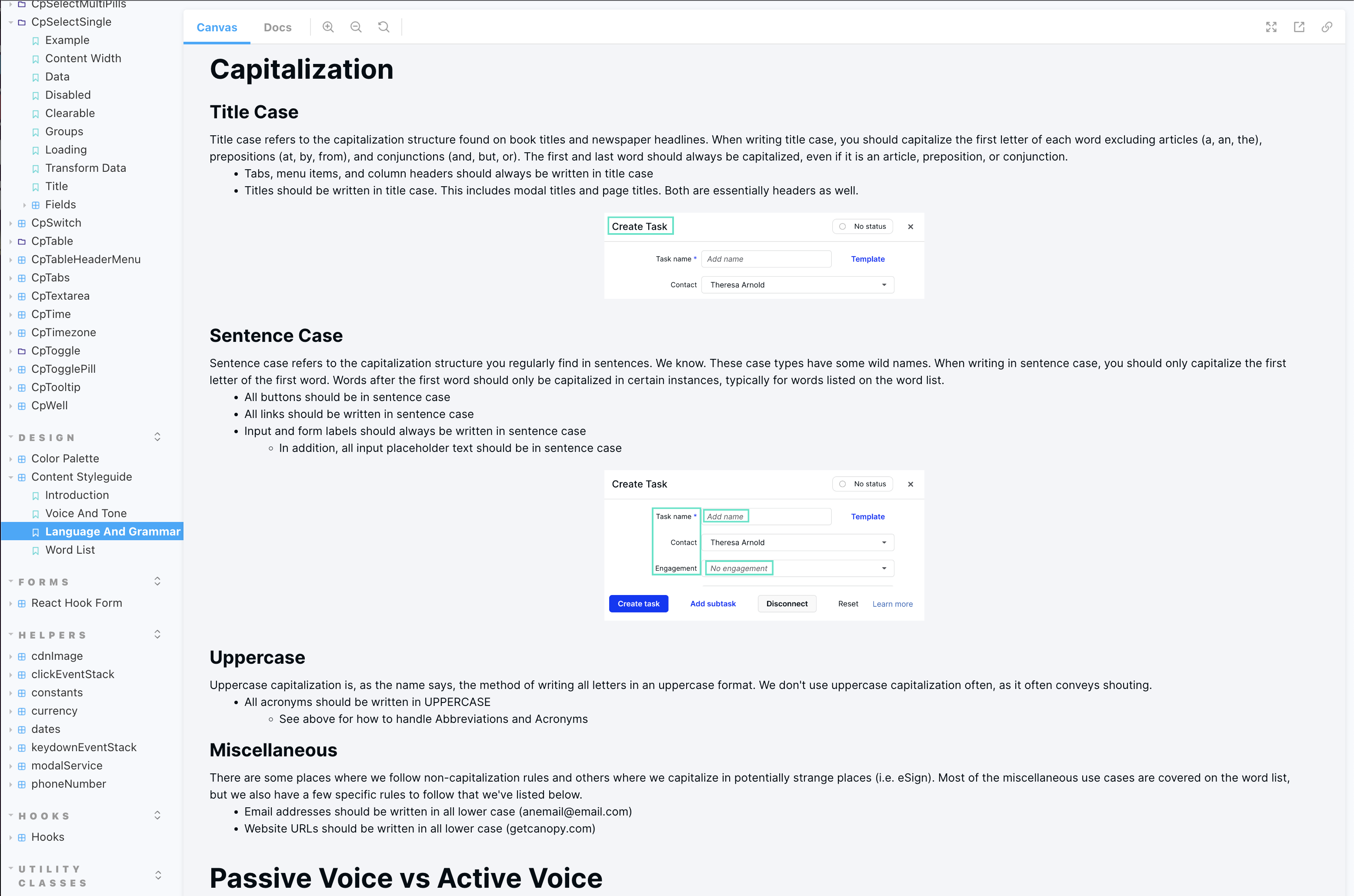
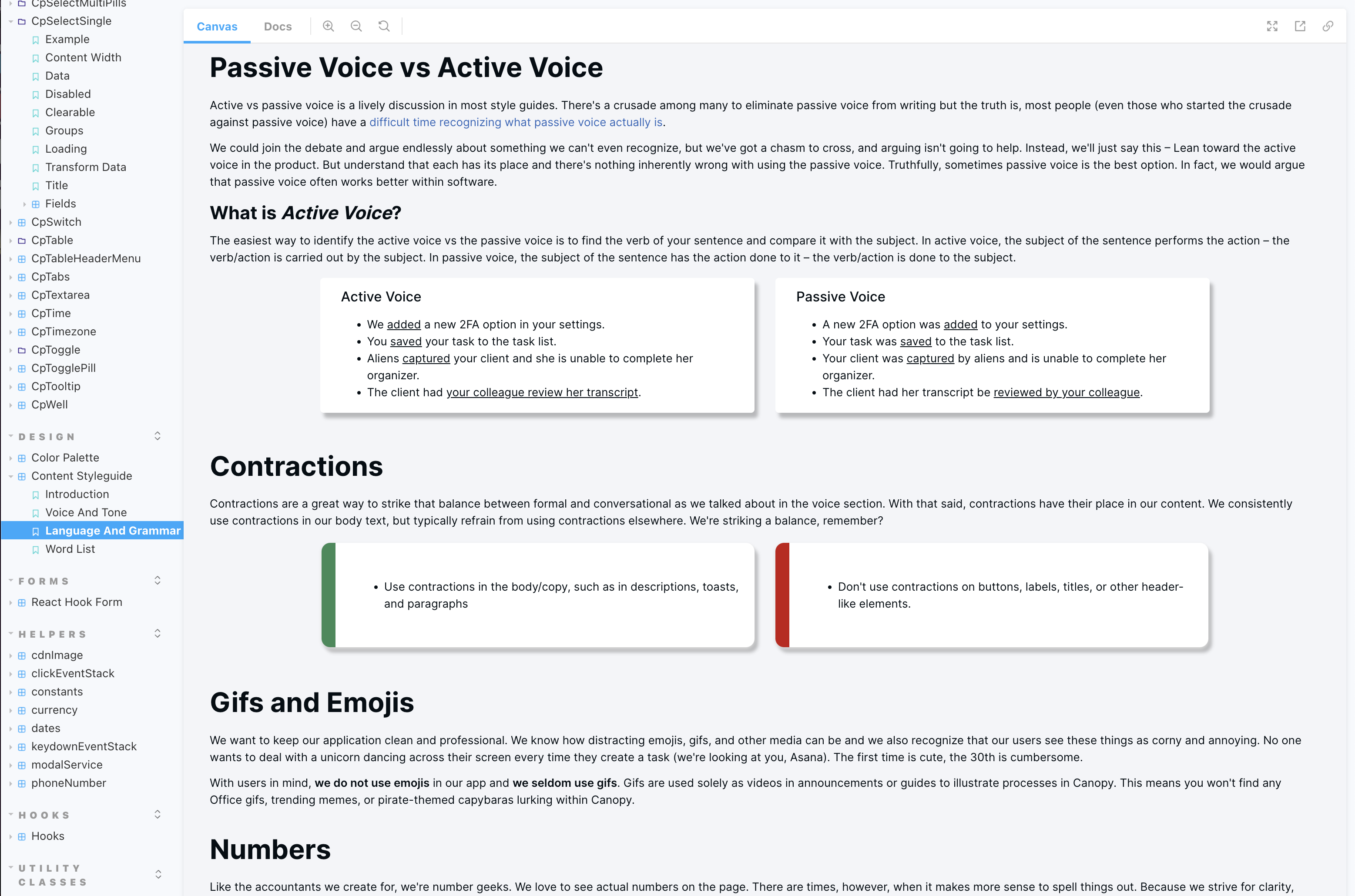
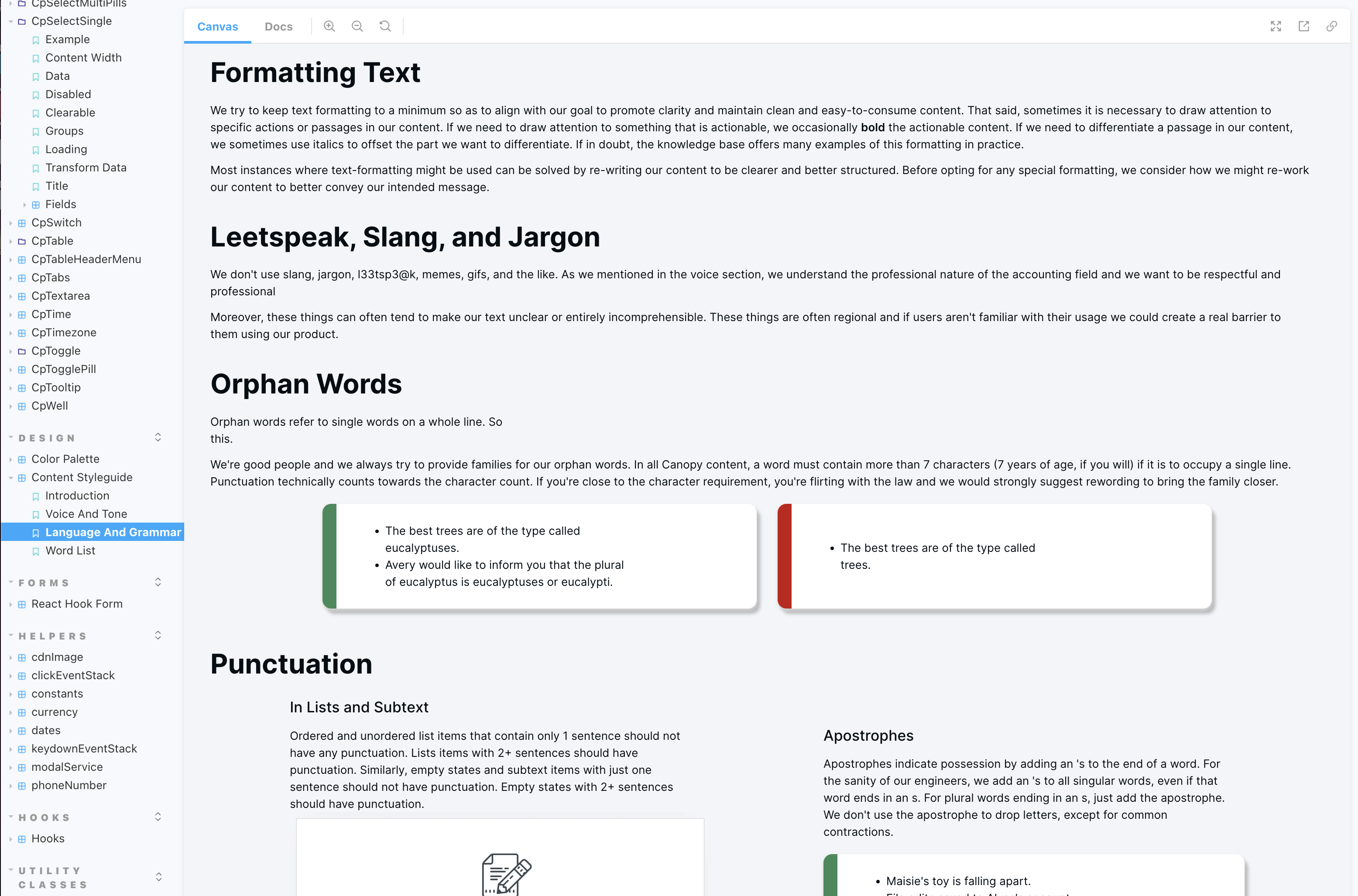
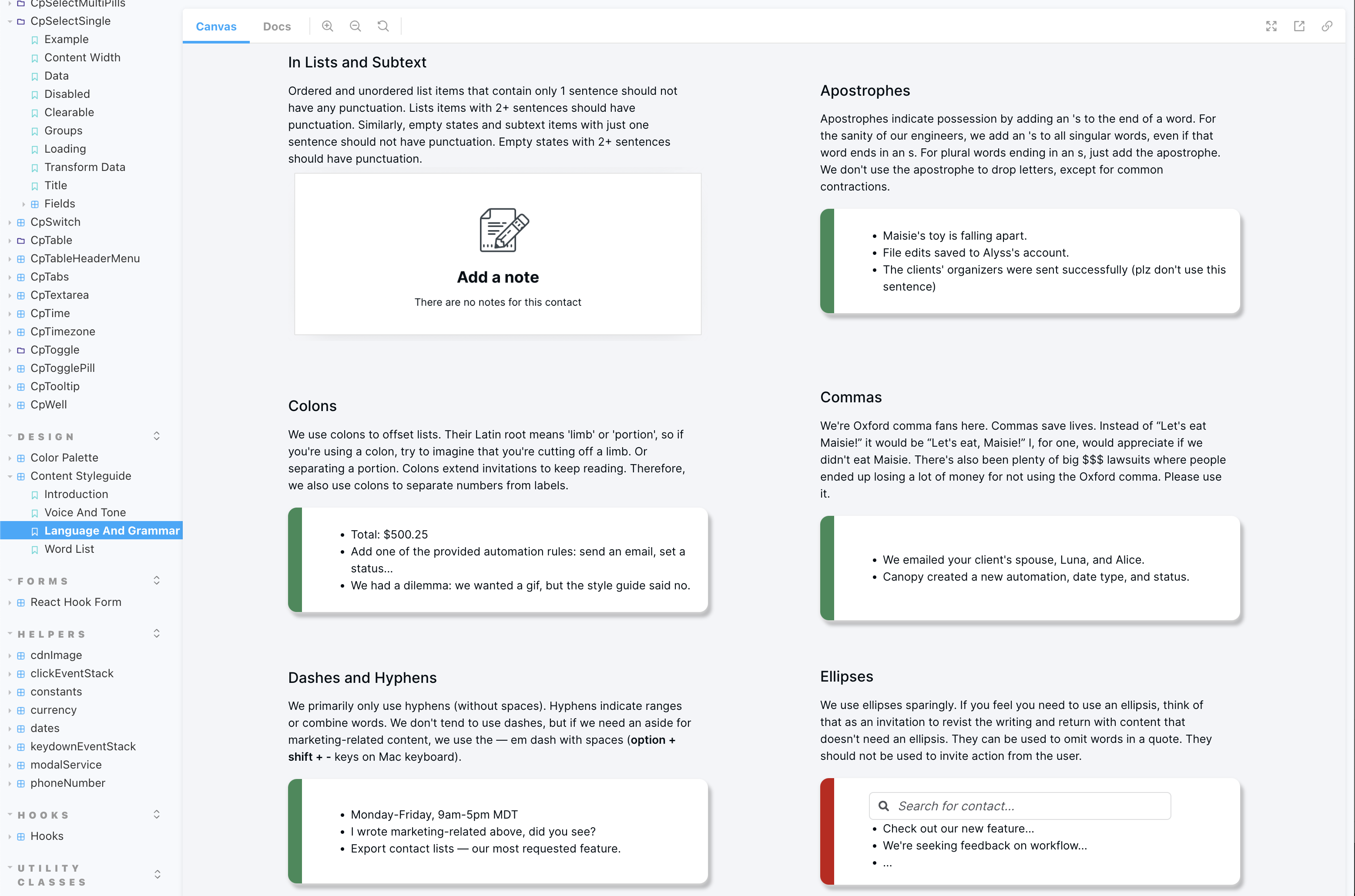
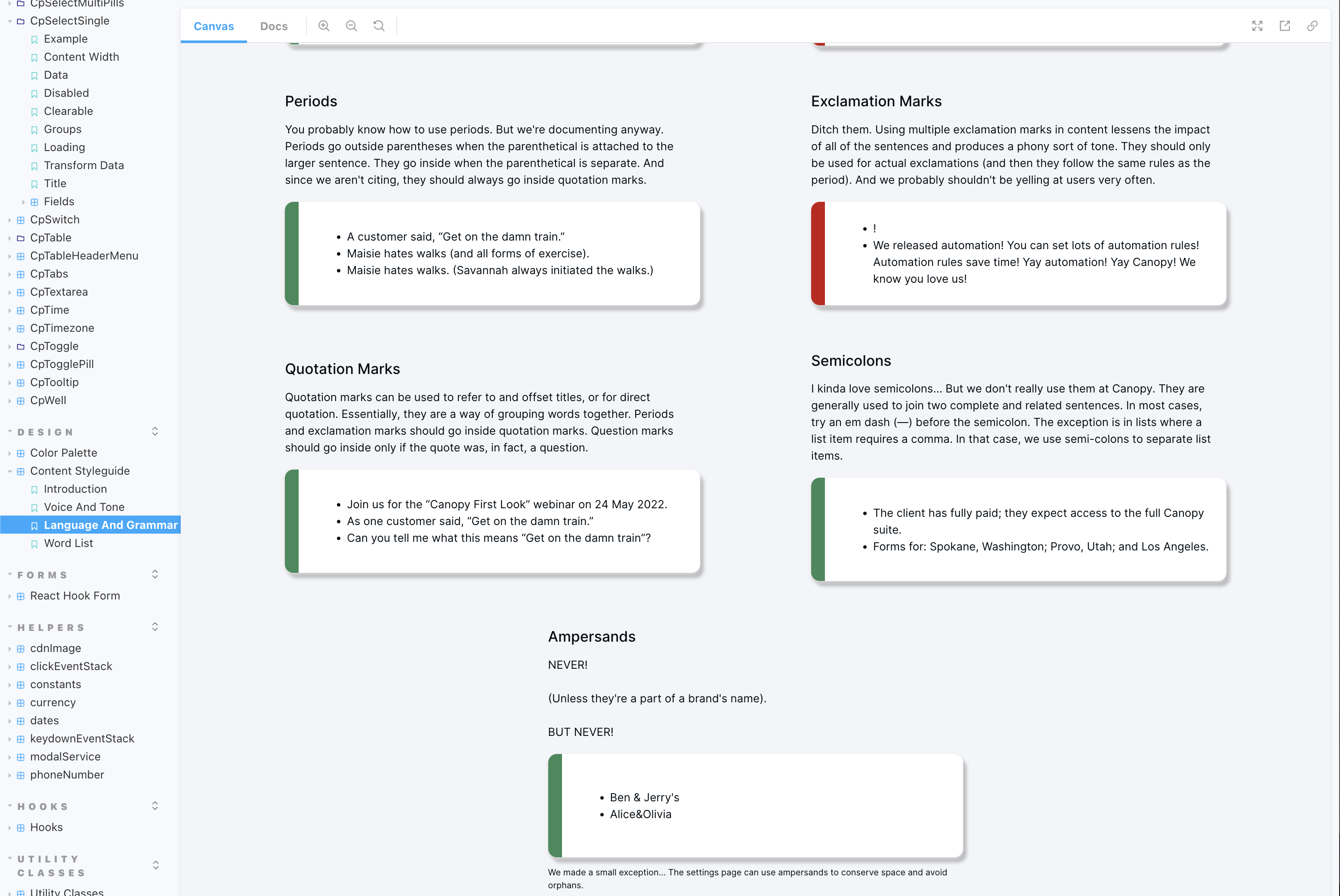
I jumped into Figjam to build out a structure for the content style guide, outline necessary categories, and drill down to the most important information to make accessible to all designers. I sought to define a voice and tone, establish grammar and content guidelines, and provide a Canopy specific word-list to define how certain words, phrases, and acronyms are used at Canopy.
Make it Accessible
After designing the style guide in Figma, I aligned with our engineering teams to combine the content style guide with their online component library. I gained access to the GitLab repository and set about building what I had designed in Figma to display on our Storybook website. I then made continuous, iterative updates to the style guide as new problems needed solving, addressing any new concerns brought up by design, QA, and engineering.
Watch it Work
Having an accessible content style guide allowed me to work more efficiently with the UX designers on our team. Gone were the days of lorem ipsum prototypes — designers could now try their hand at some basic content, following the guidelines set out by the style guide, and I could help tidy things up as needed. Although I still played a significant role in the UX process for each design, having a style guide and gaining alignment as an organization on Canopy's voice, tone, and grammar usage allowed me to focus a little more on the design aspect of content design and less on the generative copy for each of our six development squads. We began to move faster, and we produced content that promoted the same consistent messaging across Canopy's whole product.