Canopy Product Emails
OVERVIEW
Canopy’s product emails were previously written by engineers, with language that was not accessible to the non-engineering brains among us. The emails were also quite bland, didn’t show any of Canopy’s personality, and barely any of Canopy’s branding. I redesigned the email templates to align with the brand and better promote our products. I fixed all of the cumulative errors that had come up in the content and ensured that the styling all matched our content style guide. I created more helpful emails by rewriting each email to offer more consumable, accessible, and informative content.
PROJECT GOALS

Promote product branding and personality, and match new style guide principles
Update content to establish a consistent and professional tone, with useful and actionable information
Modernize our client communications to provide a more delightful holistic communication experience
LESSONS & OUTCOMES
Product emails offer a quick win for communicating brand personality and branding
Emails are often overlooked by product orgs — your customers can tell
Clear and engaging content improves the holistic user experience, especially as they are often the first touch point in any user flow
ROLE
Content Designer
Figma, Research, HTML, CSS, Javascript/JSX, Postmark, GIT/GitLab
MY INPUT
- Storyboard and mock-up several email design templates
- Research preferred templates and information architecture
- Redesign email templates for each Canopy app (Canopy users and Client Portal users)
- Identify new marketing opportunities within emails to promote our mobile apps, help resources, and socials
- Rewrite all emails to promote clarity, comprehension, and scannability
- Coordinate with engineering leads to implement new designs, and assist with coding efforts where able
Problem
Our emails had a few problems that desperately needed addressing.
- We routinely had customers reach out to the Success team to report frustration and confusion with regard to what triggered emails and what emails were trying to convey.
- After going through some rebranding we never updated the emails. They were about as basic as could be and they didn’t include our new colors or align with our new style guide.
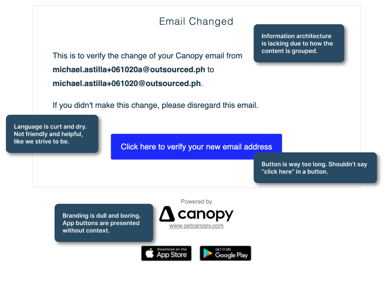
- The content of our emails did not follow any consistent guidelines. Emails were also often treated as an afterthought, meaning much of the content in them ended up being confusing and not very helpful.
- Canopy users were having issues with their clients sending replies to the Canopy emails. This meant practitioners weren’t receiving vital communications from their clients resulting in some lost clients.
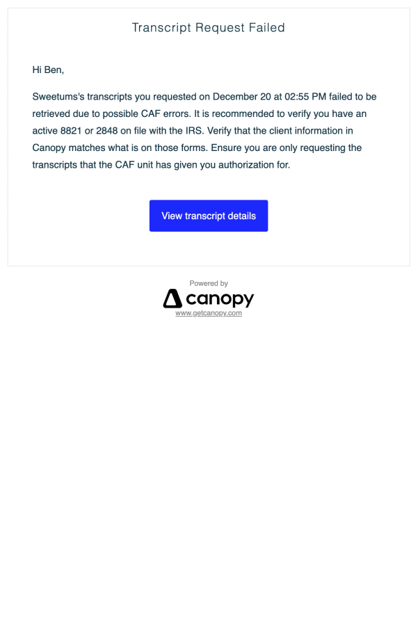
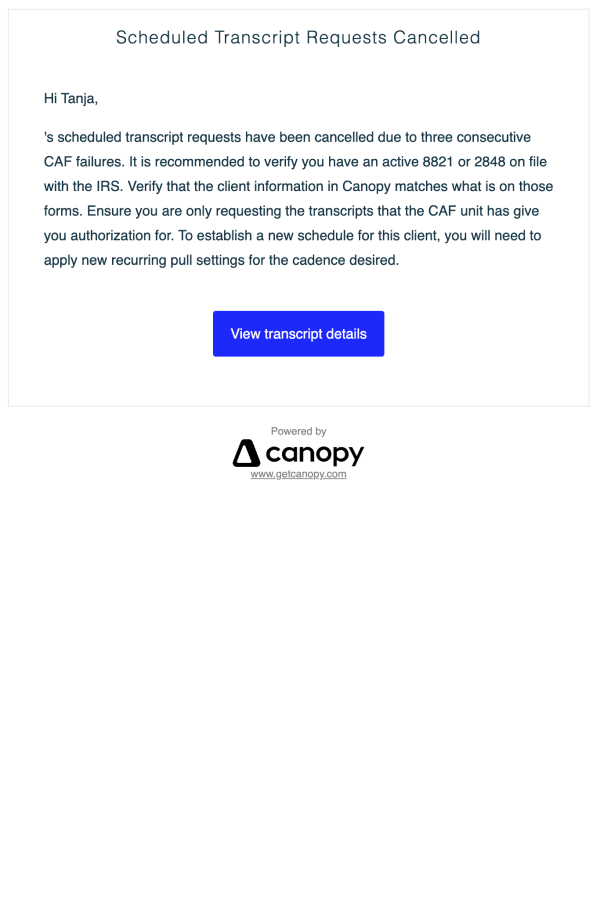
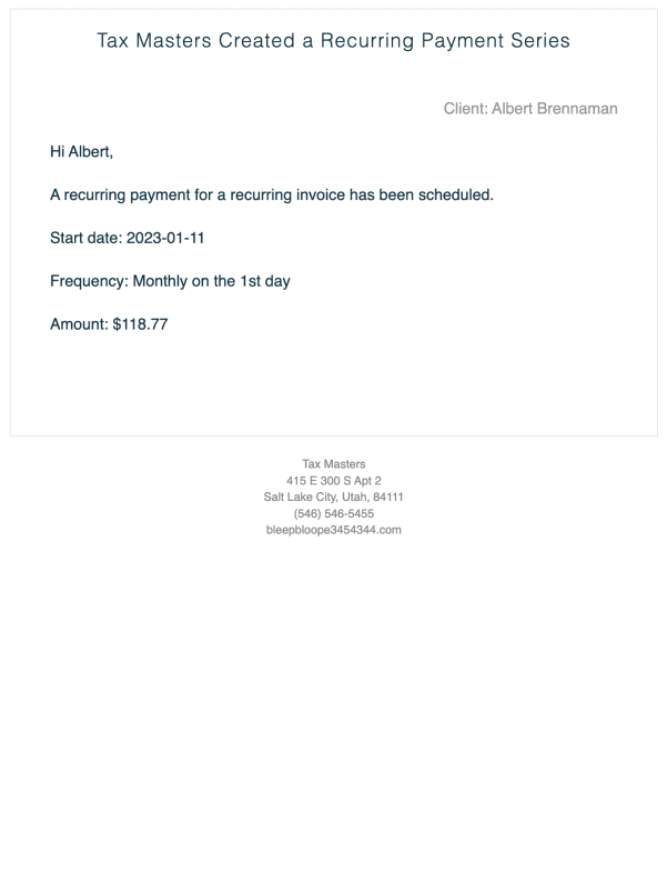
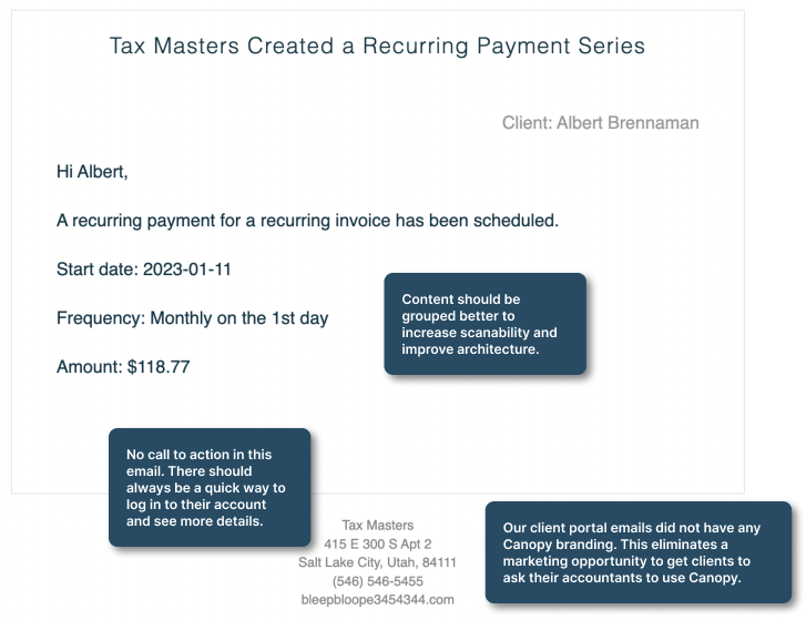
Old Emails
While conducting research for this project, I also identified a marketing opportunity to try and promote our mobile applications more. We wanted to treat emails as the first step in a user flow and design a fully thought-out path for users to complete tasks related to an email.
Finally, I had to work to get this project prioritized. As a product and UX team, we knew the importance of updating our emails. Marketing was also eager to see the improvements. But we needed to find a way to peel engineers away from squad work to get these updated. In the early days of my research phase, I explored how frequently each email was sent. We then got the engineering team to help code out our templates and get running on the most frequently sent emails. I stepped in to update the code for the less frequently sent emails allowing us to move faster as a team and complete the project without as large of an engineering commitment.
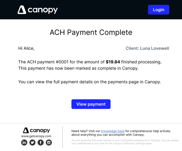
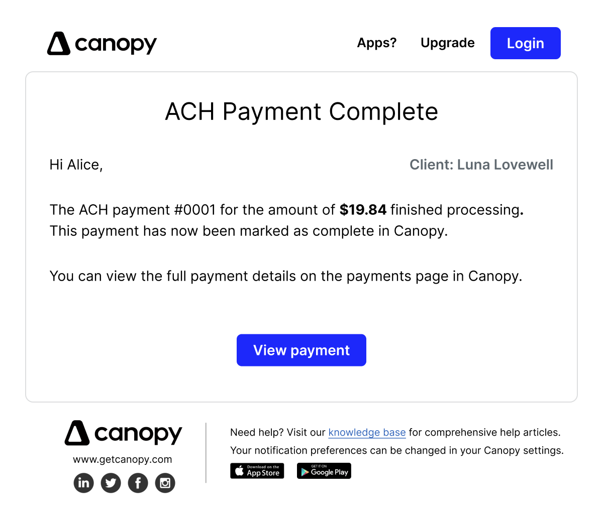
Early Designs
Solution
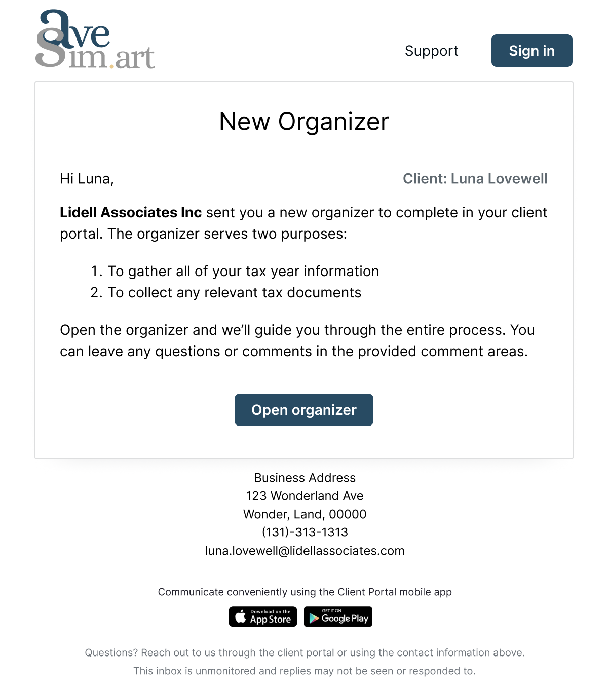
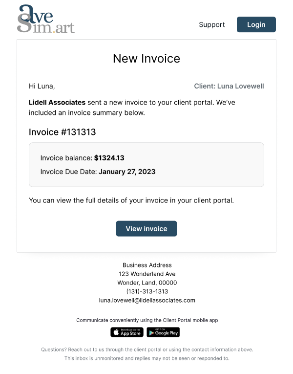
Make Canopy Visible
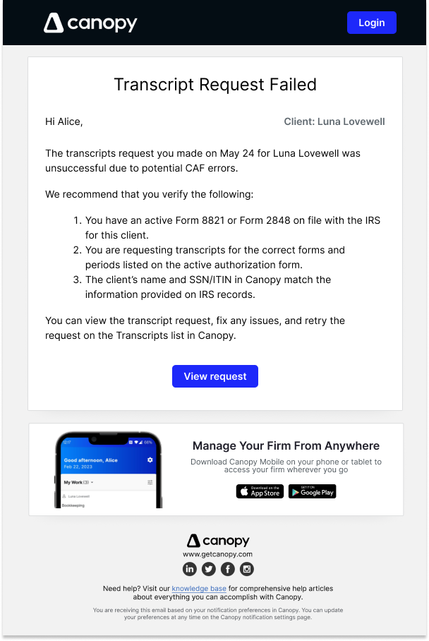
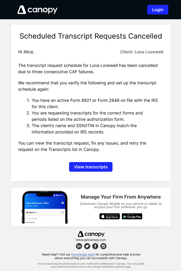
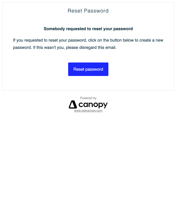
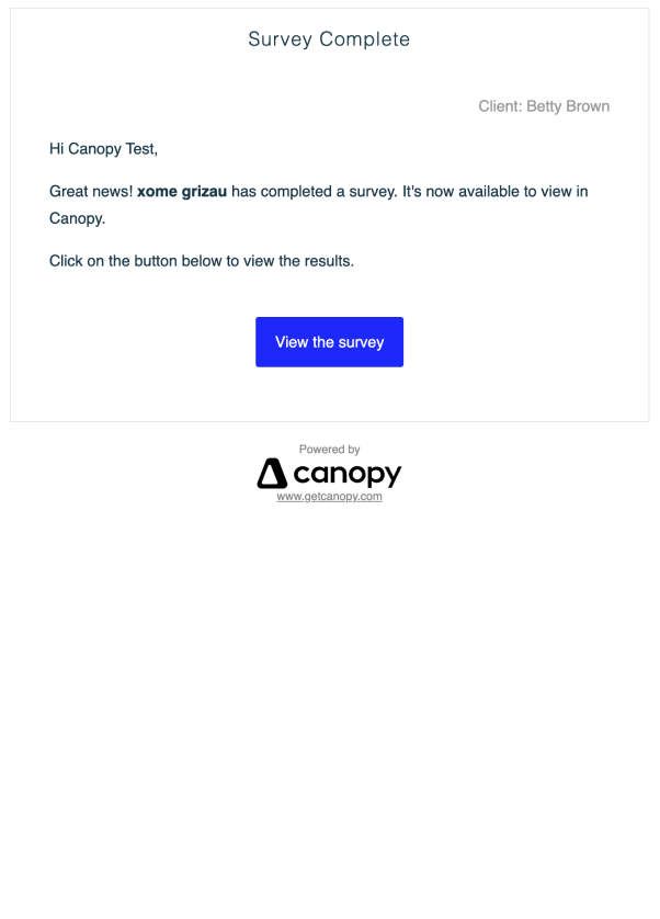
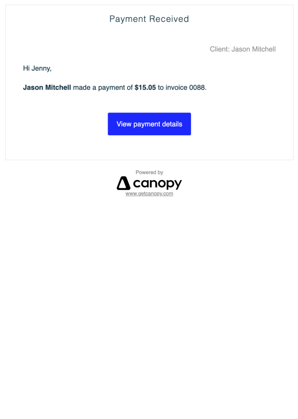
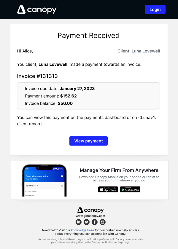
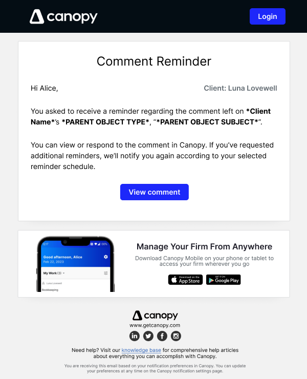
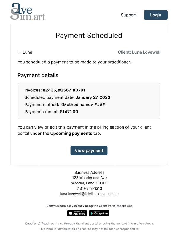
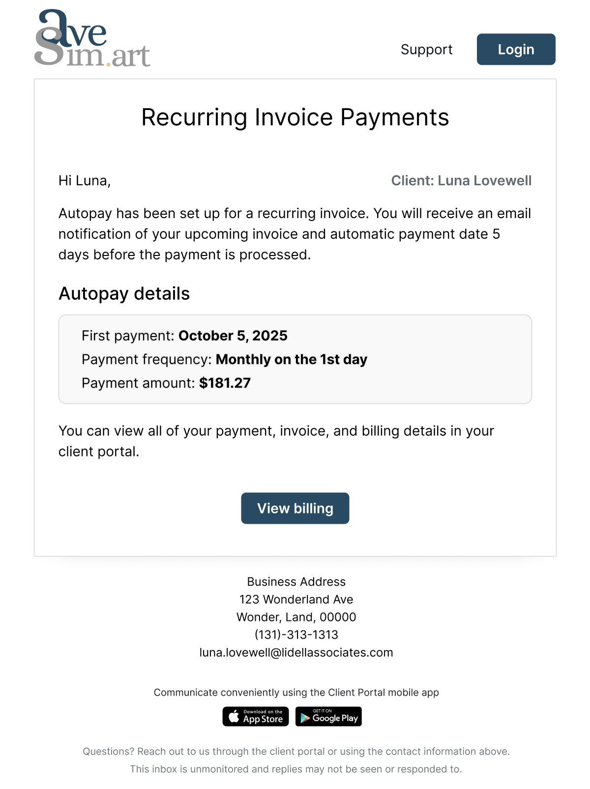
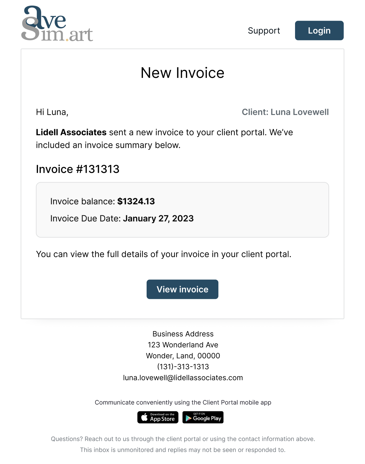
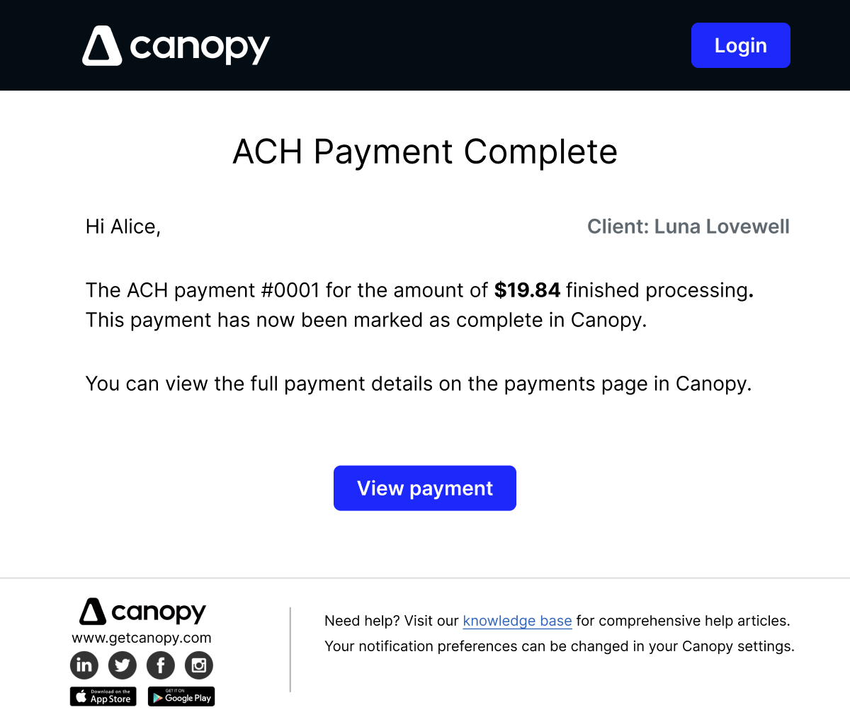
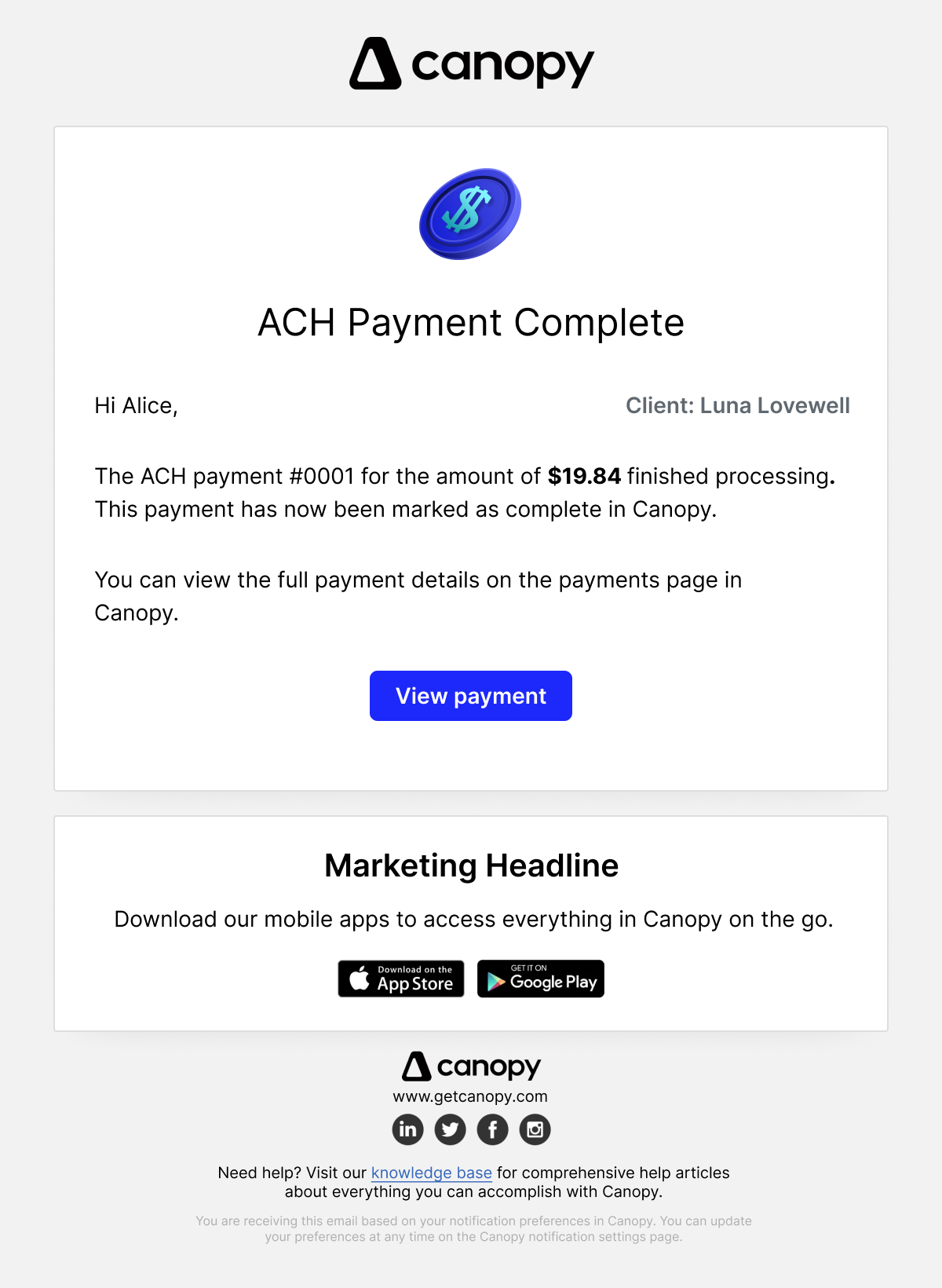
One of my primary goals in redesigning our emails was to make sure that users knew who was sending the email. We wanted Canopy to be upfront, visible, and align with our current branding. This was true for both our practitioner app and our client portal app. Because emails are one of the first touch points in any user flow, we wanted to make sure that users were greeted with the Canopy they knew, and that our branding could help bring out the feelings of comfort, delight, and helpfulness that we cultivate throughout our product.
Make the Content Helpful
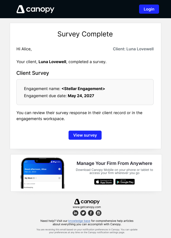
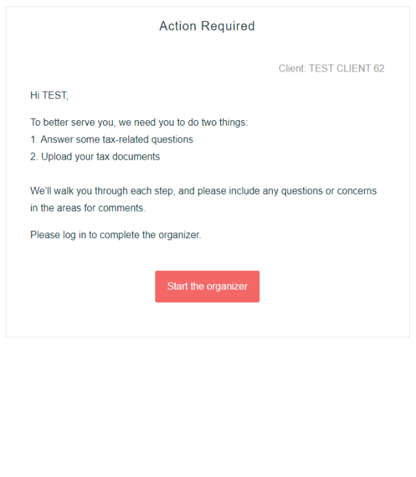
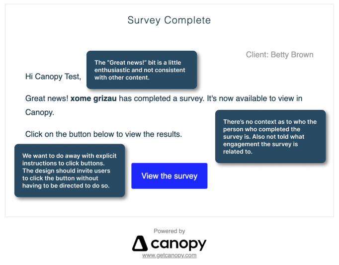
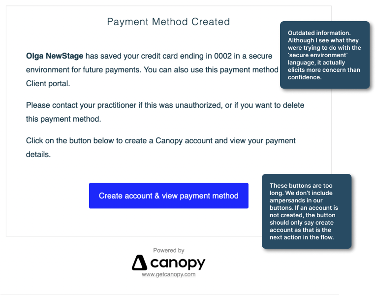
So many of our previous emails had confusing content that both didn't align with our new style guide principles and failed to present actionable information to our clients. Many of the emails also suffered from poor information architecture, decreasing scanability and increasing the cognitive load needed to comprehend all of the information presented. I built the new emails to be more complex, with wells to help group information, and better spacing to help improve information processing. I also rewrote each email to be clearer, more concise, and to reflect the rules and guidelines laid out in our content style guide.
Embrace the Quick Wins
While designing the new emails, I identified several areas for quick, cross-departmental wins for Canopy.
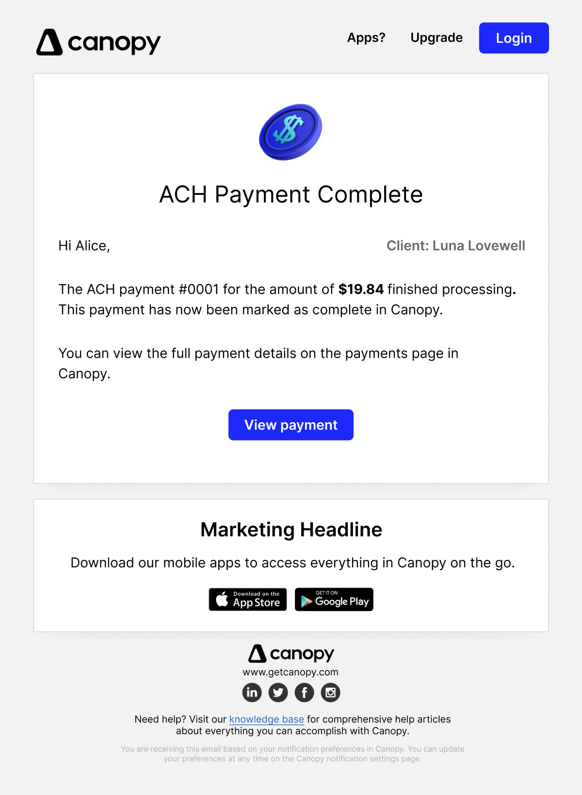
- We made our mobile app callout more prominent and pleasant. Canopy had a company-wide initiative to try to push a mobile-first product and having a prominent callout was a quick way to drive adoption and spread the word about our mobile product. In the future, this well could also be quickly updated to promote other company initiatives.
- We added the ability to log in to Canopy's home page on every email. This would help users to go through their emails and decide whether they wanted to complete the CTA in the email, or just go to Canopy's home page. This addition was especially important for Client Portal users.
- We added direct links and callouts to our support resources. This was also a huge win for client portal users. Canopy does not offer 1:1 support for client portal users, only practitioners. I did, however, write many support articles for client portal users to address concerns and solve issues. Having a link to quickly access support helped inform clients where they could go to get help, and kept them from pestering their accountants with any small issue.